
- Text boxes that are manually added to Worksheets are not associated with any specific cells. They are like “floating items” on the Worksheet. They would create barriers to assistive technologies.
- Whenever possible, write the text information in the cells directly.
- Do not align the text manually by pressing Spacebar to create white space; or by creating merged or split cells.
- While this may create a visual appearance of realigned text, screen readers would read these multiple empty spaces as “Blank”.
- Multiple empty spaces means that users of screen readers would keep listening “Blank”. It can be very annoying and confusing to the users.
- Merged or split cells would also create barriers to assistive technologies.
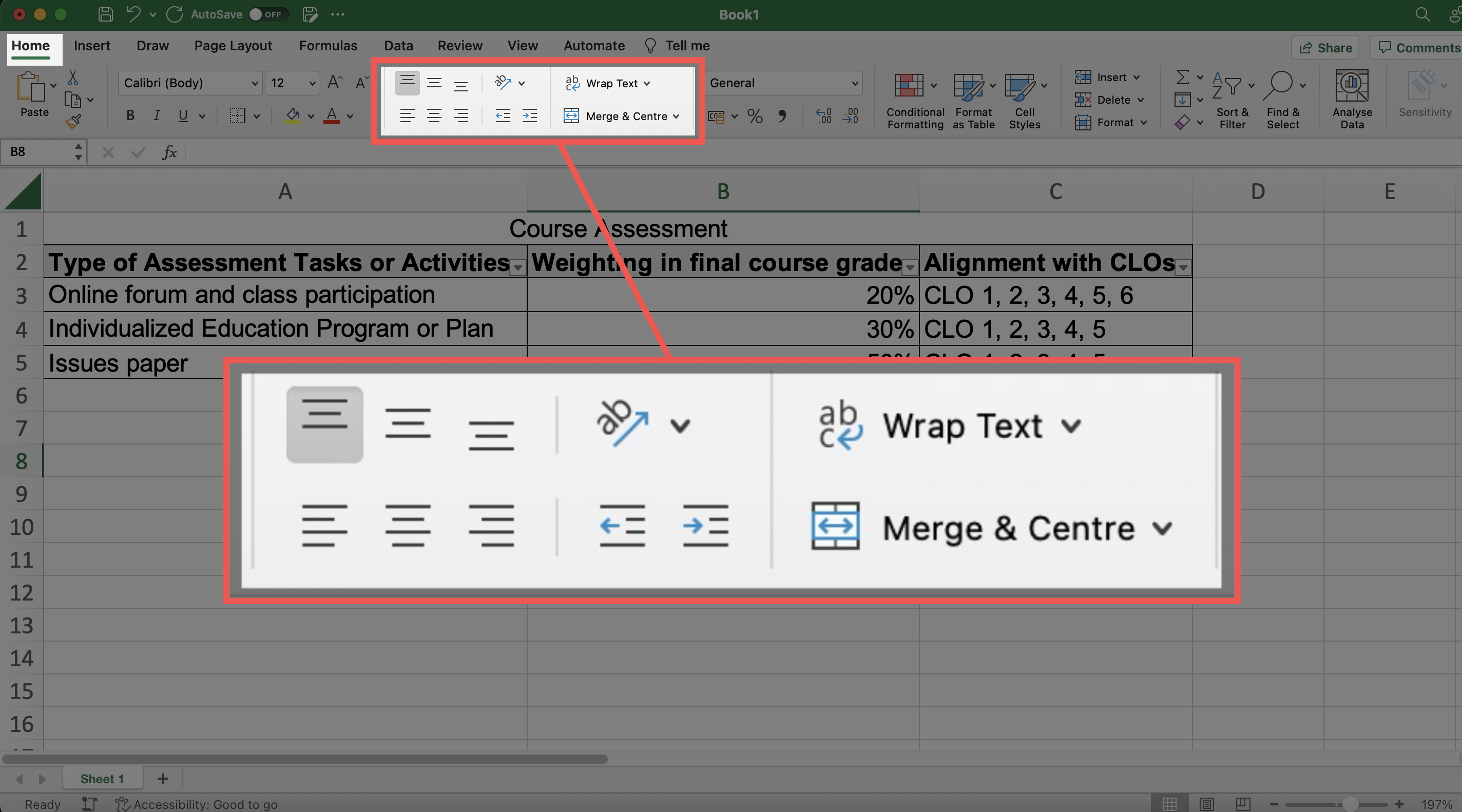
- It is suggested to make use of the Excel’s built-in commands for text alignment, orientation, indentation, and wrapping in the Home tab to adjust the position of text in a cell.
- Avoid using the Orientation command to rotate the text particular angles.
- Screen reader users and magnifier users might be unable to access the rotated text.
- Sometimes, if the column width is too narrow, the content in that column might display as a series of hashtag symbols (i.e., #####) instead of the original text.
- Those hashtags would cause confusion to readers.
- Adjust row height or column width to create sufficient white space around the text in cells between adjacent rows and columns to avoid cluttering.
- Cluttered text might be difficult for all readers to understand, particularly magnifier users, some people with visual impairment, reading disabilities, and/or dyslexia.
- Adjust the column width to fit the length of the text content to make it visible properly.
- Make sure to check colour contrast. Content with sufficient colour contrast is easier for everyone to read. Content without sufficient colour contrast would be inaccessible to many users, particularly:
- People who are colour blind;
- People with visual impairment;
- People viewing the spreadsheets through monitors in bright sunlight or glare;
- People viewing the spreadsheets through a projector display in a well-lit venue.
- Make use of software applications to check colour contrast.
- Colour contrast is checked against the Web Content Accessibility Guidelines (WCAG) using these checkers. Enter the colours of the background and foreground (e.g., text), respectively.
- These checkers generally allow multiple methods of entering colours, such as the colour picker tool, RGB colour codes, or hex colour codes. The colour picker is particularly useful to users who are unfamiliar with colour codes.
- Then, the checkers will tell whether this colour combination would fulfil or fail the colour contrast requirements based on the WCAG Guidelines.
- If it fails, then it might suggest that we need to consider changing the colour of either the background or the foreground colours, or both. Otherwise, this colour combination might not be visually accessible to some readers.
- After we change the colours, re-do the check, until you get a combination that fulfils the accessibility requirement.
- Examples of colour contrast checkers that are free-of-charge:
- WebAIM Contrast Checker: An online checker.
- WebAIM Link Contrast Checker: An online checker. It helps check the colour contrast between the link text, the surrounding body text, and the background colour.
- Colour Contrast Analyser (CCA) from TPGi: It needs to be downloaded onto your computer, available for both Windows and Mac. It also provides a Color Blindness Simulator.
- Adobe Colour Contrast Analyzer: An online checker. You may input the text colour and background colour values or upload a screenshot of your project to pick the colours you want to check for contrast. It will also recommend colours that would give better contrast. In the Accessibility Tools tab of the Adobe Colour Contrast Analyzer, apart from general colour contrast checker, you can choose the Colour Blind Safe Checker to check whether the colour theme or palette would be accessible for people with colour blindness.
- Ensure sufficient colour contrast between text and its associated cell background.
- Do not use “colour-on-colour” background and text, such as light blue text on dark blue background.
- Check whether the coloured text and its associated cell background colours are properly displayed in grayscale.
- It is useful and important practice because some students may print out course materials as handouts in grayscale.
- Try selecting the other colour filters from the dropdown menu to view the spreadsheets in simulated colour blindness situations.
- Fix any parts in the spreadsheets that do not present the intended meanings under colour filters.
- Examples of colour filters for checking grayscale display:
- Windows Built-in colour filters:
- Go to Start > Settings > Ease of Access > Colour Filters. Switch on the toggle for colour filters.
- Mac Built-in colour filter:
- Go to Apple menu > System Preferences > Accessibility > Display > Select Colour Filters > Select Enable Colour Filters > Select Grayscale in the dropdown menu. Then the grayscale filter will be applied to the entire screen.
- Windows Built-in colour filters:
- Appropriate font size can make the text more comfortable and easier to read.
- The font size should not be too small, especially if the spreadsheets will be presented by projector.
- Larger fonts would be more accessible for people with visual impairment. It also helps students sitting at the far end of classrooms or lecture halls.
- Avoid having extremely large and small texts together.
- Ensure the proportion of font sizes.
- Some readers may need to magnify the electronic version of the documents. They may get lost in the texts with extreme font sizes after magnifying the documents.
- Use appropriate punctuation.
- Otherwise, it would make users assistive technologies such as screen readers difficult to understand the content.
- Be aware of punctuation that visually looks similar but symbolize different meanings.
- Example: Be aware of the differences between the marks of ” inches, ‘ feet, ’ apostrophe, “ ” quotation marks.
- Use the marks of “smart quotes” as the quotation marks.
- Do not use the marks of “straight quotes” as the quotation marks.
- Be aware that some punctuation may not be read out by screen readers.
- Example: “8-9 pm” may simply be read as “eight nine pm”. It is suggested to use text to present important information, if possible, such as “8 pm to 9 pm.”
- Capitalizing all text is difficult for most people to read.
- Text with all caps or small caps may show no differences in the shapes of texts, and all the texts may visually appear like a single “rectangle.”
- It would particularly create barriers to some people with visual impairment and some people with reading disabilities.
- Serif fonts have small lines at the edge that may hamper readability.
- Examples of Serif fonts are Times New Roman, Courier, and Baskerville.
- Sans-Serif fonts do not have decorative lines at the edge.
- Examples of Sans-Serif fonts are Arial, Calibri, and Verdana.
- Sans-Serif fonts are generally preferred to Serif fonts.

- Some fonts may not be available in most of the common computer systems.
- For example, Helvetica is a recommended Sans-Serif font. It is available on Mac but not Windows. Be aware that Helvetica text may or may not displayed as Helvetica style in different computers as intended.
- Avoid only decorative fonts or light fonts.
- Some users, especially people with dyslexia, might find it hard to read decorative fonts and those whose letters are close to one another.
- Be aware that SmartArt requires Alt Text. Assistive technologies such as screen readers may not be able to read the text on SmartArt.
- Each Worksheet visually appears like a large “table” with columns and rows by default. It is common to make use of manual formatting such as borders line, colour, font sizes to create visual appearance of a “table” for data presentation.
- However, this visual appearance of such a “table” cannot be recognized by assistive technologies such as screen readers.
- It is important to format the specific range of cells as “Table” using the built-in formatting tool instead of manual formatting, such that assistive technologies such as screen readers could identify this cell range as truly a “table”.
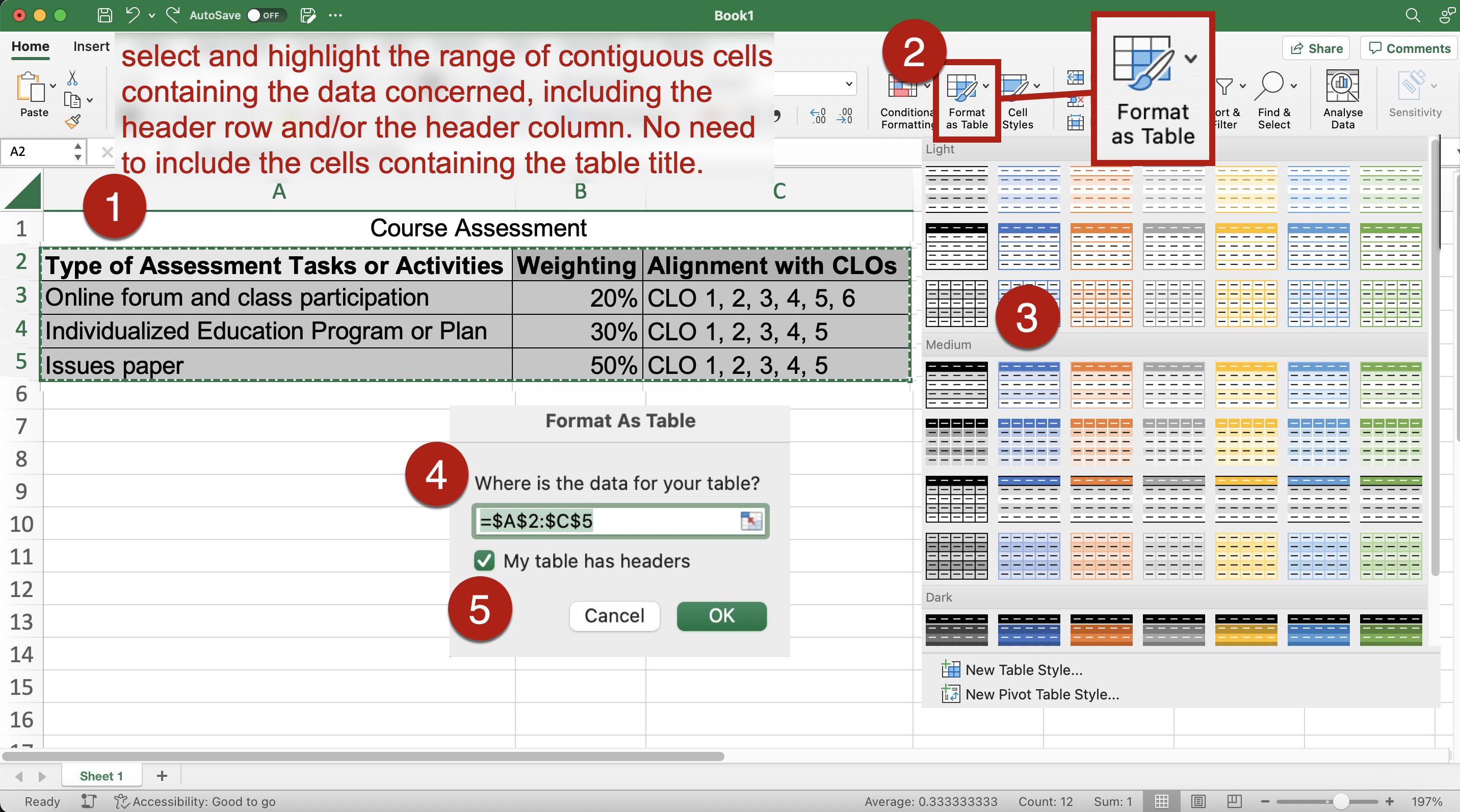
- To format a table:
- Be sure there is a header row and/or a header column for the table.
- Select and highlight the range of contiguous cells containing the data concerned, including the header row and/or the header column. No need to include the cells containing the table title.
- Go to Home > Select Format as Table. Choose your preferred table style.
- Choose the table style with sufficient colour contrast. You may also check the colour contrast of the table design and modify the colours later.
- The Format as Table dialog pane opens. Check whether the cell range shown in the field of Where is the data for your table? in the Format as Table dialog pane. correctly corresponds to your selected cell range. If the cell range is wrong, fix it.
- Select and check the option My table has headers in the dialog if your table has headers.
- Select OK.
- Instead of highlighting the whole range of contiguous cells containing the data concerned, you may first select any cell within your dataset. Input the cell range manually in the field of Where is the data for your table? in the Format as Table dialog pane. Follow the rest of the steps.
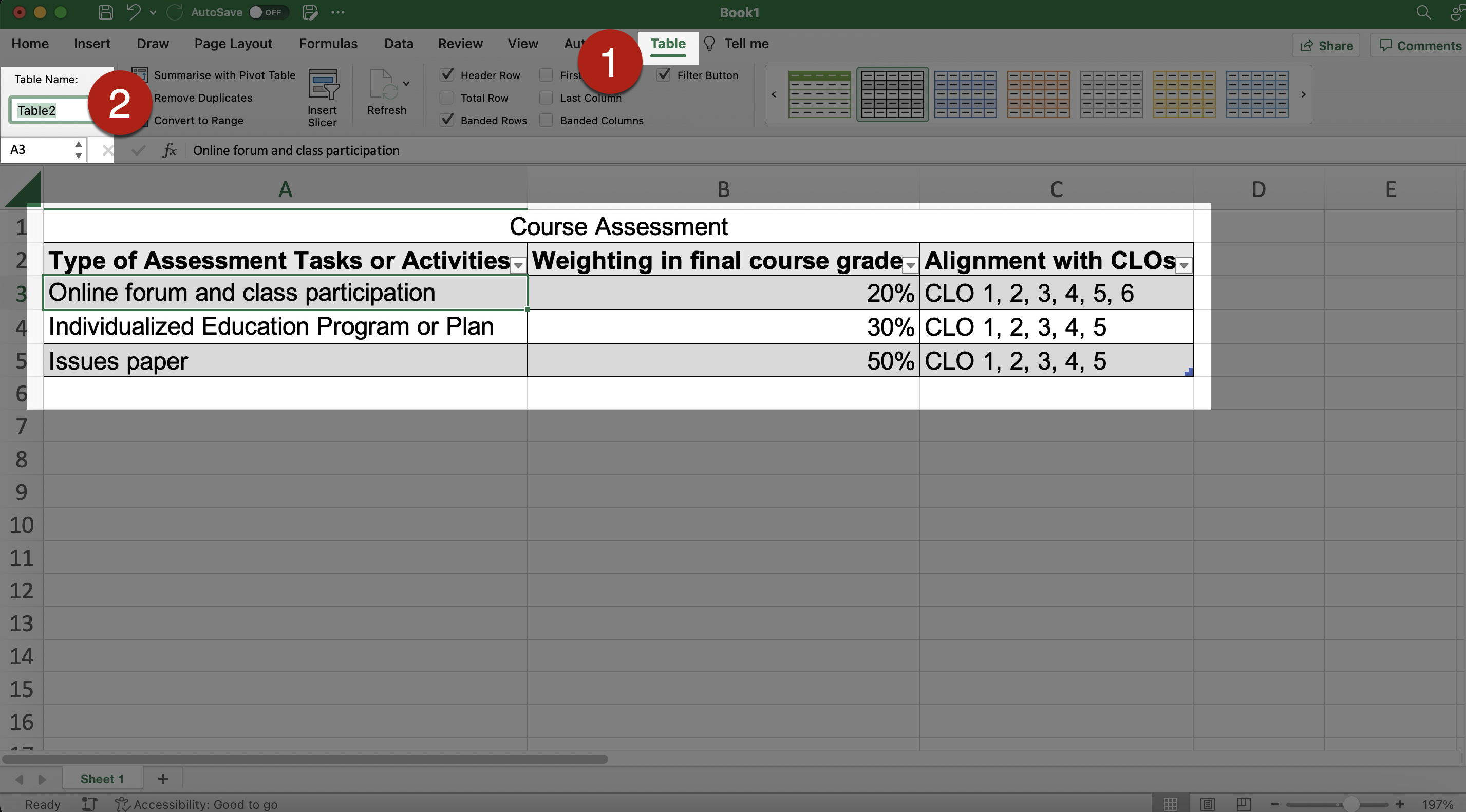
- A table should always have the header row and the column header that meaningfully describe the corresponding data.
- Sighted users may be able to identify row and column headers based on the visual presentation of the table.
- However, the header information is necessary for assistive technologies such as screen readers to identify columns and rows. Screen readers count and read aloud the number of columns and rows. Then, screen readers can read the information in each cell one by one from left to right, and from the top to the bottom.
- To specify header row:
- Highlight the header row of the table.
- Go to Table Design tab.
- Check the option Header Row and/or the option First Column, depending on the design of your table.
- Specifying the headers will apply bold formatting to the text content in the cells of these specified headers.
- Do not specify header row by manually formatting the cells and texts of the first row, e.g., using bold and larger text. While it may create a visual appearance of “header”, screen readers cannot identify it as truly a header.
- A descriptive title can help users identify and get a quick idea of each table content. It can facilitate content navigation and understanding.
- Center the table title that corresponds to the table width.
- It may visually help users to identify each table.
- With proper formatting, centering the table title may also let assistive technologies know that this title corresponds to a table with a specific number of columns.
- Do not center the title text manually by pressing Spacebar to create white space.
- While this may create a visual appearance of centered text, screen readers would read these multiple empty spaces as “Blank”. Multiple empty spaces means that users of screen readers would keep listening “Blank”. It can be very annoying and confusing to the users.
- It is suggested to make use of the Excel’s built-in commands for Merge & Center.
- To center the table title:
- Select and highlight the title row, including the cells that correspond to the table width.
- Go to Home tab > Merge & Center.
- Select the Merge & Center from the dropdown menu.
- Each formatted table is named “Table1”, “Table2”, and so on by default in the order the tables are created.
- If there are many tables in the file, the default names such as “Table1” and “Table2” might not be informative enough to let users differentiate and refer to a particular table quickly.
- Give a unique and informative name for each formatted table to help users identify and locate each table more easily.
- The names of all the formatted tables are shown in the Name Box near the Formula Bar. Selecting any table from the dropdown list from the Name Box can automatically jump to that table, regardless of its location across the Worksheets. Therefore, unique table names are important and can help all readers locate the tables more easily.
- To rename a formatted table:
- Select any cell within the formatted table.
- Go to the Table tab > Table Name.
- Enter the new name in the field of Table Name.
- The table name should be unique and descriptive.
- Do not use cell range references to be the table name.
- Do not include a space in the table name.
- Do not duplicate other existing names in the Workbook.
- The default names of each row header, column header, cells, and cell ranges are simply the cell location references (e.g., “A2”, “G19”, “BF15”, and “E2:E9”). They might be difficult to recognize and understand.
- It is important to give a brief and descriptive name for each column header, row header, cells, and cell ranges.
- It can greatly help screen reader users identify what the rows and columns are about, especially when there are many data and complicated tables in the Workbook.
- All defined names would appear in the dropdown list in the Name Box near the Formular Bar.
- Users can select any name from this dropdown list from the Name Box and automatically jump to that table, cell, or cell ranges, regardless of its location across the Worksheets.
- Overall, it can help all users to understand and navigate the information in the Workbook.
- The defined names should be unique and descriptive.
- Do not use cell range references to be the names.
- Do not include a space in the names.
- Do not duplicate other existing names in the Workbook.
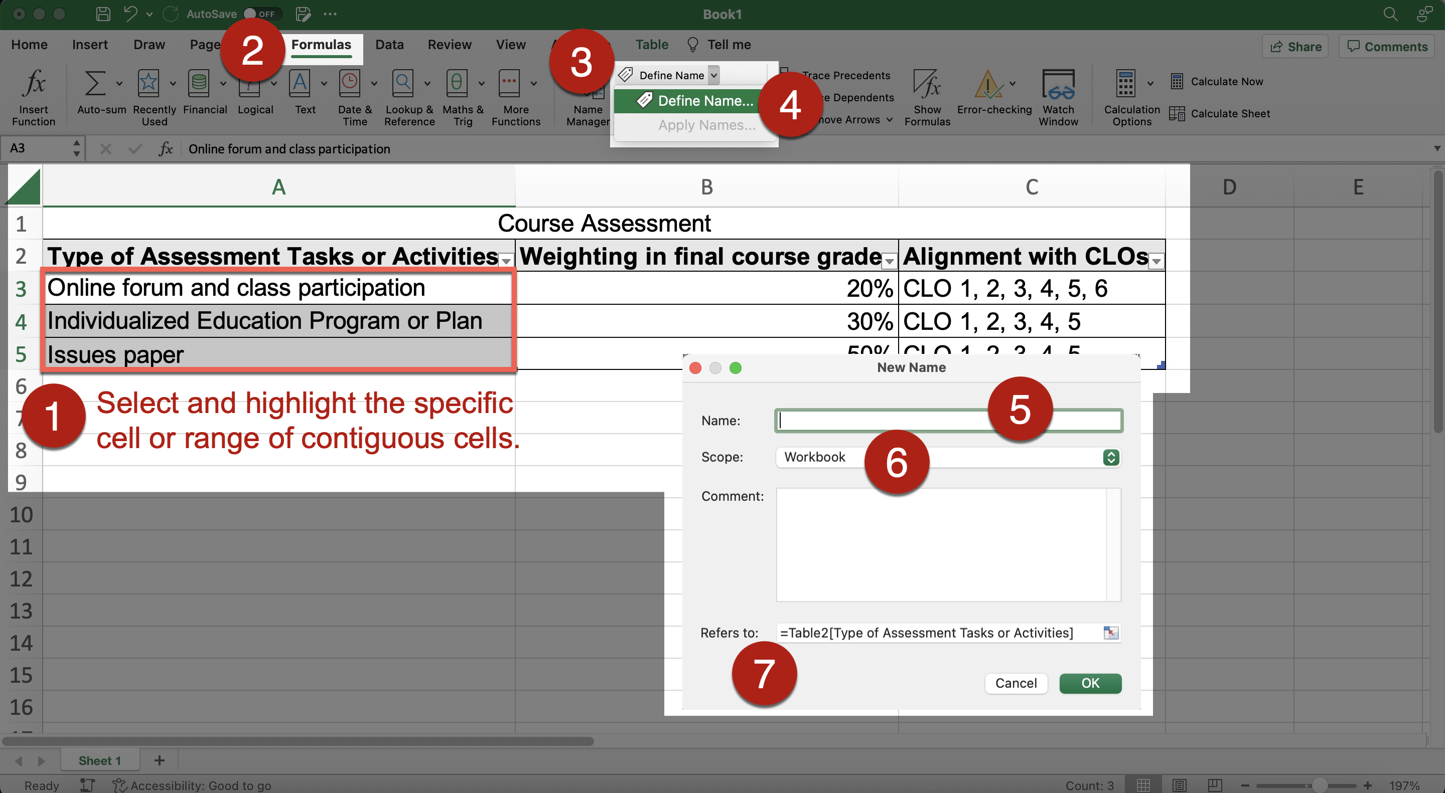
- To define name for specific cell or cell ranges:
- Select and highlight the specific cell or range of contiguous cells.
- Go to Formulas tab > Define Name. Or right-click and select Define Name from the dropdown menu. The New Name Pane
- Enter the desired name for this cell or cell range in the Name field in the New Name Pane.
- Check whether the cell location references in the Refers to field in the New Name Pane correspond to your selected cell or cell ranges correctly. Fix it if needed.
- Select OK.
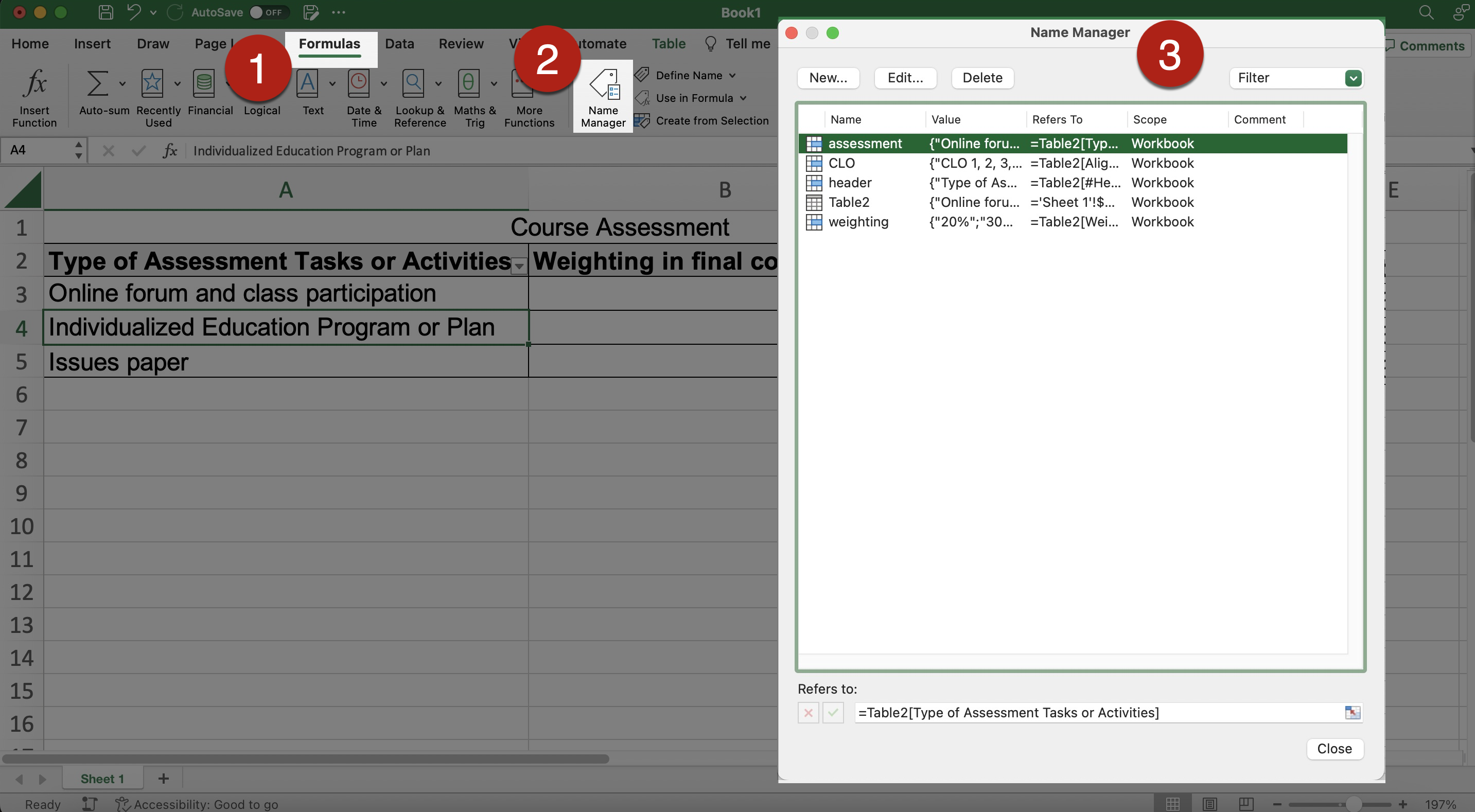
- To edit several cells, or cell ranges, altogether:
- Go to Formulas > Name Manager.
- Edit the information as needed.
- References:
- Use simple tables whenever possible.
- Screen readers read the information in each cell one by one from left to right, and from the top to the bottom.
- Screen readers count the number of columns and rows to locate the header information.
- Avoid merged cells, nested cells, split cells, or multiple headings.
- These designs make screen readers lose count of the number of rows and columns.
- It makes screen readers difficult to keep track of their locations in the Worksheet.
- They could not recognize the data cell by cell properly and cannot read out meaningful information from the table.
- Avoid blank cells.
- Blank cells can be confusing to assistive technologies.
- Screen readers may assume there is nothing more in the table.
- Use some text or symbols to clearly indicate cells that are intentionally left blank.
- It let all users, whether using assistive technologies or not, know whether the blank cells are intentionally left blank or accidentally missing data.
- It is also a recommended practice of data cleaning in conducting research. Examples of text that may be used are: “No data”, “Intentionally left blank”, “n/a”, “Missing data”.
- If you want to use symbols, be aware that whether those symbols are in general accessible to assistive technologies.
- If you include the blank cells on purpose, you may mention the purpose in the Alt Text of the table or the body text to let screen readers understand it.
- Sometimes, if the column width is too narrow, the content in that column might display as a series of hashtag symbols (i.e., #####) instead of the original text. Adjust the column width to fit the length of the content to make it visible properly.
- Those hashtags would cause confusion to readers.
- Adjust row height or column width to create sufficient white space around the text in cells between adjacent rows and columns to avoid cluttering.
- Cluttered text might be difficult for all readers to understand, particularly magnifier users, some people with visual impairment, reading disabilities, and/or dyslexia.
- Do not use multiple blank rows, columns, or cells to create spacing or format layout of the Worksheet.
- Those multiple blank space might make screen readers mistakenly assume this is the end of the data in this Worksheet.
- Adjust the row height or column width to create the desired spacing, instead of using multiple blank rows or columns.
- To adjust row height or column width:
- Click and drag across the column/row borders in the column/row heading cells for the columns/rows that you want to adjust.
- References: Change column width or row height in Excel for Mac. Microsoft.
- Do not align the text manually by pressing Spacebar to create white space; or creating merged or split cells.
- While this may create a visual appearance of realigned text, screen readers would read these multiple empty spaces as “Blank”. Multiple empty spaces means that users of screen readers would keep listening “Blank”. It can be very annoying and confusing to the users. Merged or split cells are not accessible to screen readers.
- Make use of the built-in commands for text alignment, orientation, indentation, and wrapping in the Home tab to adjust the position of text in a cell.
- Avoid rotating the text (the Orientation command) to particular angles. Screen reader users and magnifier users might be unable to access the rotated text.
- Alternative text (“Alt Text”) concisely describes the content and the purposes of the table in brief phrases or 1-2 sentences. Alt text can help assistive technologies understand graphical content, including tables.
- Example of Alt Text of a table: A table with 4 columns and 5 rows listing the full score, weighting, and the requirement of group work of the 4 types of assessment tasks.
- To insert Alt Text of a table:
- Select and right-click on the table. Select Table from the short-cut menu.
- Select Alternative Text from the second-level short-cut menu to open the Alternative Text Pane.
- Input the Alt Text of the table in the Description field.
- Select OK.
- Use punctuation such as periods to end the Alt Text.
- Otherwise, screen readers may mix up the Alt Text and the content in the Worksheet that follows. It may confuse the users.
- Be aware that hyperlinks in the Alt Text cannot be activated or presented by link text.
- Do not write detailed and lengthy description of tables as Alt Text.
- Provide the lengthy text description within the cells in that Worksheet instead of text boxes that are manually added to the Workbook. Use the Alt Text to refer assistive technology users to the table description.
- It would help every user understand the table, not only assistive technology users.
- Text boxes are floating objects as they are not associated with any specific cell(s). They cannot be reached readily using the arrow keys on keyboard. Assistive technologies cannot tell that its location in the grid of cells.
- Make sure to check colour contrast. Content with sufficient colour contrast is easier for everyone to read.
- Content without sufficient colour contrast would be inaccessible to many users, particularly:
- people who are colour blind;
- people with visual impairment;
- people viewing the spreadsheets through monitors in bright sunlight or glare; and
- people viewing the spreadsheets through a projector display in a well-lit venue.
- When formatting a table, it is suggested to choose the table style with sufficient colour contrast.
- Make use of software applications to check colour contrast of the table design and modify the colours.
- Ensure sufficient colour contrast between text and its associated cell background in tables.
- Do not use “colour-on-colour” background and text in tables, such as light blue text on dark blue background.
- Check whether the coloured text and its associated cell background colours are properly displayed in grayscale. Some students may print out course materials as handouts in grayscale.
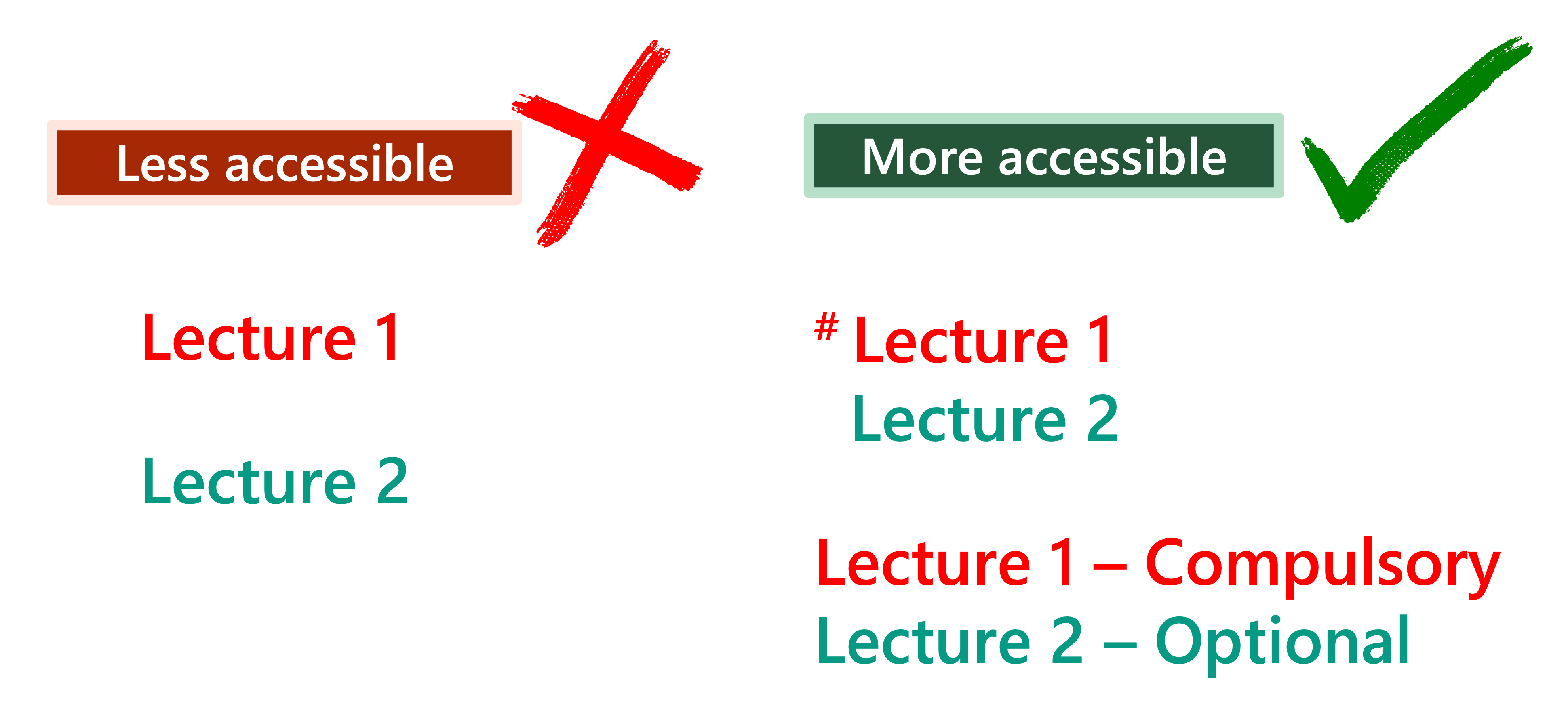
- People with colour blindness, low contrast sensitivity, or some visual impairment, may have difficulty distinguishing between certain colours. Therefore, using colour as the only visual cue to convey important information could hinder understanding of the table content.
- To enhance accessibility, use multiple visual cues, such as colour, symbols, and text, to present information to enhance accessibility to wider range of users.
- For example, red text is used to represent“Compulsory lecture” and green text is used to represent “Optional lecture” in the table, respectively.
- Some users such as people with colour blindness may be unable to differentiate the red text and the green text.
- Users who print out the slides in grayscale may also be unable to differentiate the colours.
- To improve accessibility, use multiple visual cues, such as colour, symbols, and text, to indicate “Compulsory lecture” and “Optional lecture” in the table, respectively.
- References: Charts & Accessibility. Pennsylvania State University
- More examples of using multiple visual cues to present information in a more accessible way.
- Visualizing the data as charts and graphs would help some users to understand the data.
- However, because charts are rich in visual information, they would inherently present accessibility barriers to some users such as users with visual impairment and assistive technologies users. It would hinder equal opportunities of participation in the teaching and learning activities.
- When the charts and graphs are generated from specified datasets in Excel, it is important to apply accessible formatting to both the charts and graphs and the associated dataset as an accessible table.
- When possible, position the charts and graphs close to the associated data tables on the same Worksheet to facilitate navigation and users’ reference.
- Data tables are associated with specific range of cells. But charts and tables are not associated with any specific cells. They are examples of items that “float” on Worksheets. They cannot be reached readily using the arrow keys → ← ↑ ↓ on keyboard. Assistive technologies may be unable to tell the location of each chart and graph within the grid of cells.
- It is suggested to use hyperlinks to indicate the locations of the chart and data table that are associated. It can facilitate navigation.
- Each formatted chart is named “Chart 1”, “Chart 2”, and so on by default in the order the charts are created. The names of all the formatted charts are shown in the Name Box near the Formula Bar.
- If there are many charts in the Workbook, the default names such as “Chart 1” and “Chart 2” might not be informative enough to let users differentiate and refer to a particular chart quickly.
- Give a unique and informative name for each formatted chart.
- These unique chart names could help screen reader users identify and locate each chart more easily. Unique chart names are important and can help all readers locate the chart more easily.
- To rename a formatted chart and graph:
- Select the formatted chart.
- Enter the new name in the Name Box.
- Press the Enter key on the keyboard to apply it.
- The chart name should be unique and descriptive.
- Do not include a space in the chart name.
- Do not duplicate other existing names in the Workbook.
- Do not use cell range references to be the chart name.
- Because charts and graphs are not associated with any specific cells, and they are like floating on the worksheet.
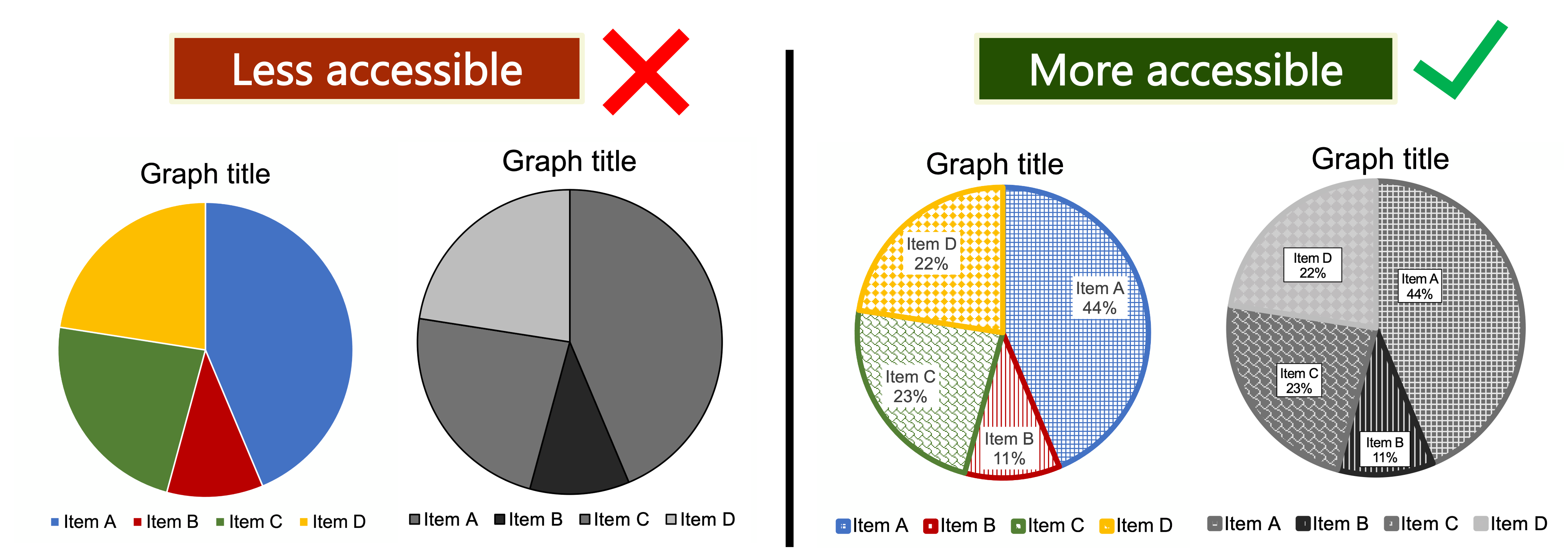
- People with colour blindness, low contrast sensitivity, or some visual impairment, may have difficulty distinguishing between certain colours. Therefore, using colour as the only visual cue to convey important information could hinder understanding of the charts and graphs.
- To enhance accessibility, use multiple visual cues to present information to enhance accessibility to wider range of users. Examples of such visual cues are colour, pattern fill, line style (e.g., solid, or dotted lines), data labels, text description, and/or legend.
- Example: Use colour, pattern, and text labels, to identify each pie section of pie charts. Put the text labels near or directly on the corresponding pie section to enable readers to understand the chart clearly. Do not put all the text labels below the chart.
- References: Charts & Accessibility. Pennsylvania State University
- More examples of using multiple visual cues to present information in a more accessible way.
- Make use of different chart elements to help users understand the charts and graphs.
- Examples of basic elements to be included: the chart title, axes titles, data labels, and legend.
- It provides multiple visual cues to present information to enhance accessibility to wider range of users.
- Adjust the layout of the charts and graphs for clear reading.
- Layout that appears too crowded would become barriers to many users such as some people with cognitive disabilities.
- To add different chart elements:
- Select the chart.
- Go to the Chart Design tab > Add Chart Element.
- Select the required items from the dropdown menu of the Add Chart Element command, such as the chart title, data labels, and legend.
- To adjust the layout of the charts and graphs:
- Select the chart.
- Go to the Chart Design tab > Quick Layout command.
- Select a preferred layout from the gallery in the Chart Design tab.
- Further resize and relocate the whitespace within the charts and graphs where appropriate.
- Check and ensure sufficient colour contrast of the different chart elements.
- To modify the layout in greater detail:
- Go to Format tab > Format Pane.
- Alternative text (“Alt Text”) concisely describes the content and the purposes of the charts and graphs in brief phrases or 1-2 sentences.
- Alt text can help assistive technologies understand graphical content including charts and graphs.
- Example of Alt Text of a chart: A pie chart presenting the weighting of the scores of the 4 assessment tasks toward the course grade.
- To insert Alt Text of a chart:
- Select and right-click on the chart, select View Alt Text… from the short-cut menu.
- Input the alt text of the chart in the Alt Text Pane.
- Select OK.
- Use punctuation such as periods to end the Alt Text.
- Otherwise, screen readers may mix up the Alt Text and the content in the Worksheet that follows. It may confuse the users.
- Be aware that hyperlinks in the Alt Text cannot be activated or presented by link text.
- Do not write detailed and lengthy description of charts and graphs as Alt Text.
- Provide the lengthy text description of charts and graphs directly in specific cells instead of text boxes that are manually added to the Workbook. Use the Alt Text to refer assistive technology users to the description of charts and graphs.
- It would help every user understand the charts and graphs, not only assistive technology users.
- Text boxes are floating objects as they are not associated with any specific cell(s). They cannot be reached readily using the arrow keys on keyboard. Assistive technologies cannot tell that its location in the grid of cells.
- We can insert threaded comments to cells. This can be helpful for collaborative work.
- An indicator would appear at the top right corner of the cell to notify the presence of a comment on that cell. When hovering the cursor over the cell, the comment box automatically pops up.
- However, this pop-up comment box may not be readily accessible to assistive technologies such as screen readers and keyboard-control.
- If the information in comments is important, it is recommended to put the comments in a cell directly to enhance its accessibility to all users.
- To remove a comment:
- Right-click on the cell and select Delete Comment.
- By default, there are more than thousands of blank columns and rows in each Worksheet.
- Unused columns or rows around the end of all the content in a Worksheet might be distracting to some readers, such as some people with cognitive disabilities.
- Consider hiding the unused rows or columns around the Worksheet content.
- It could make the Worksheet cleaner and prevent readers from wasting time and effort looking for any further content.
- To hide unused columns from the end of all content in the Worksheet to the last default column in the Worksheet:
- Select the first column to hide.
- Select the rest of the default columns using the keyboard shortcut keys: Shift + Control + Right arrow →.
- Go to Home tab > Format > Columns > Hide. Or right-click on any selected column, then select Hide from the dropdown menu.
- To hide unused rows from the end of all content in the Worksheet to the last default row in the Worksheet:
- Select the first row to hide.
- Select the rest of the default rows using the keyboard shortcut keys: Shift + Control + Down arrow ↓.
- Go to “Home” tab > Format > Rows > Hide. Or right-click on any selected row, then select Hide from the dropdown menu.
- Sometimes, you may want to hide one or several nonadjacent columns or rows. It can help select the interested content for both viewing on screen and printing.
- Note that the hidden columns and rows are not read by both sighted readers and screen reader users.
- If you hide the unused rows or columns, consider adding a note in the Worksheet to notify users about any hidden rows or columns. Let users know how to unhide these rows or columns themselves in case they want to add new content to the Worksheet.
- Reference: Hide or show rows or columns. Microsoft.
- Make use of the Freeze Panes function to keep specific rows and/or columns visible on screen and in place while users scroll and navigate the Worksheet.
- Go to View tab.
- Select either Freeze Panes, Freeze Top Row, or Freeze First Column.
- Note that the visual effects of Freeze Panes may not work for screen reader users. Even if you applied freezing on certain rows or columns, screen readers would not read aloud these frozen areas every time unless the users move their current locations to those frozen areas.
- If you applied any frozen column, row, or pane, consider adding a note in the Worksheet to notify users about the frozen content. Let users know how to unfreeze them.
- Remove blank and unused Worksheets to minimize confusion to assistive technologies users.
- To remove blank and unused Worksheets:
- Select the Worksheet to be removed.
- Go to Home tab > Delete > Delete Sheet. Or, right-click the tab of the Worksheet to be removed, then select Delete from the short-cut menu.
- Provide an overview of the content in the whole Excel file in Worksheet 1, especially for file containing many items and complicated content.
- Briefly describe each Worksheet. List out the item type, title, brief description, and location. Make use of hyperlinks to facilitate users to jump to particular item easily.
- Notify users about any hidden rows or columns; or any frozen column, row, or pane.
- Include the list of all defined names in the Workbook in the index page in Worksheet 1 for users’ reference to facilitate understanding and navigation.
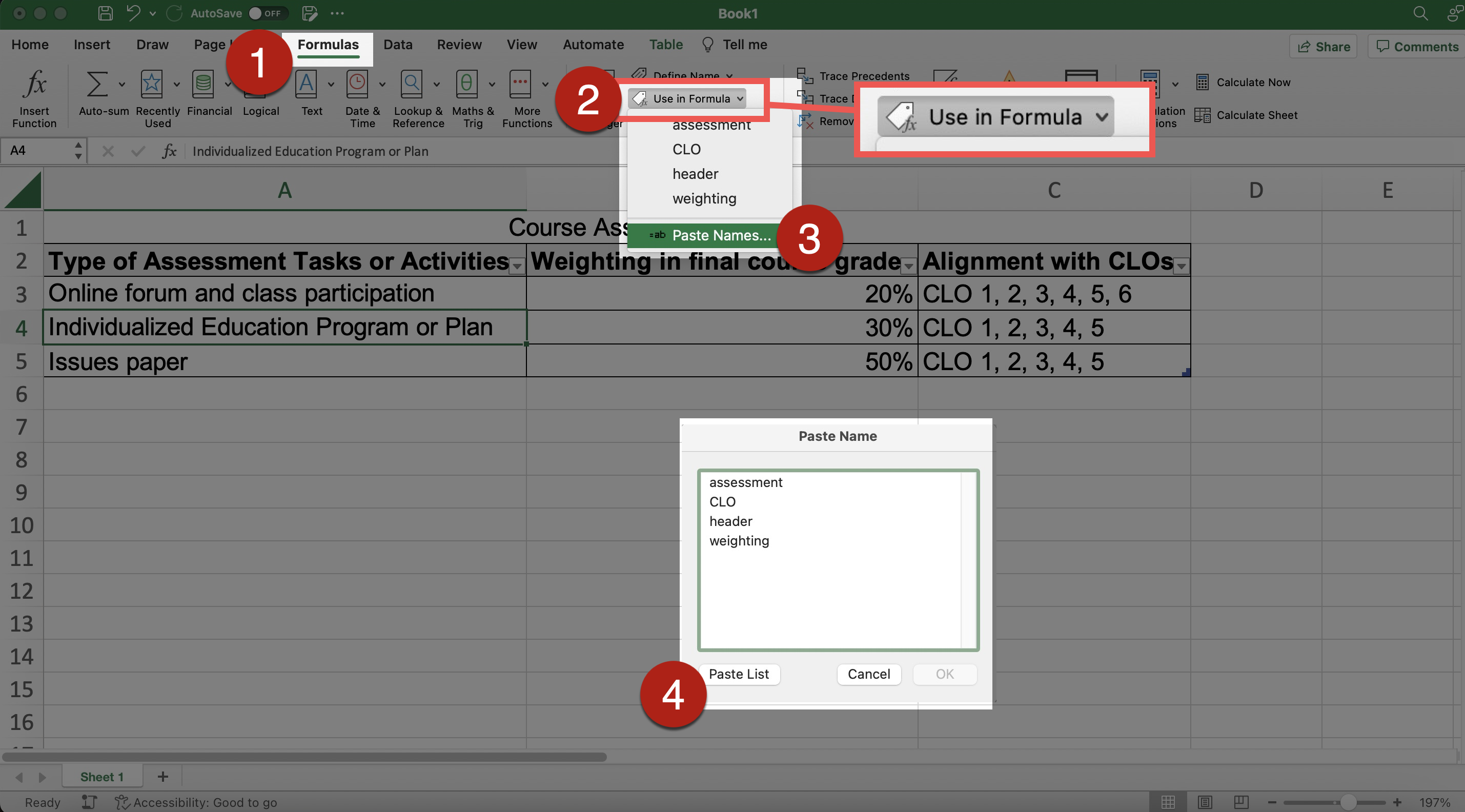
- To generate a list of defined names:
- Go to Formula tab > Define Names.
- Select Use in Formulas from the dropdown menu of the Define Names.
- Select Paste List in the dialog pane.
- An auto-generated list of all defined names and corresponding cell location references will appear.
- References:
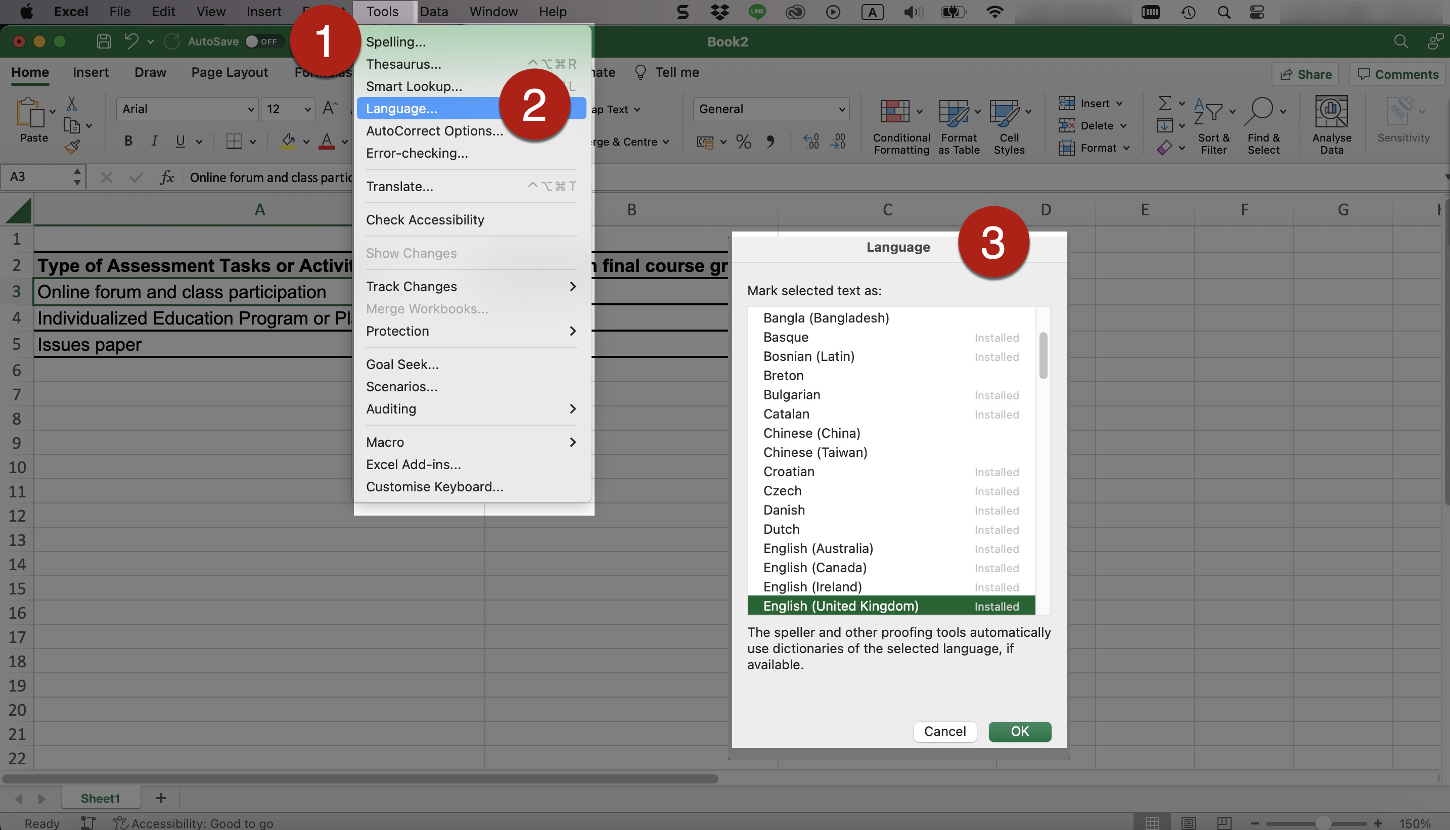
- It is important to indicate the languages within the document for assistive technologies to identify and read properly.
- To set the document language(s):
- Select and highlight the text you want to set the language for. This could be the entire document or just a particular part depending on your situation.
- Go to Tools > Language. In the Language dialog pane, select the language you want to set. Select OK.
- Repeat the procedures if you need to set another language for other parts of text in the document.
- References: Document and Content Language. WebAIM.
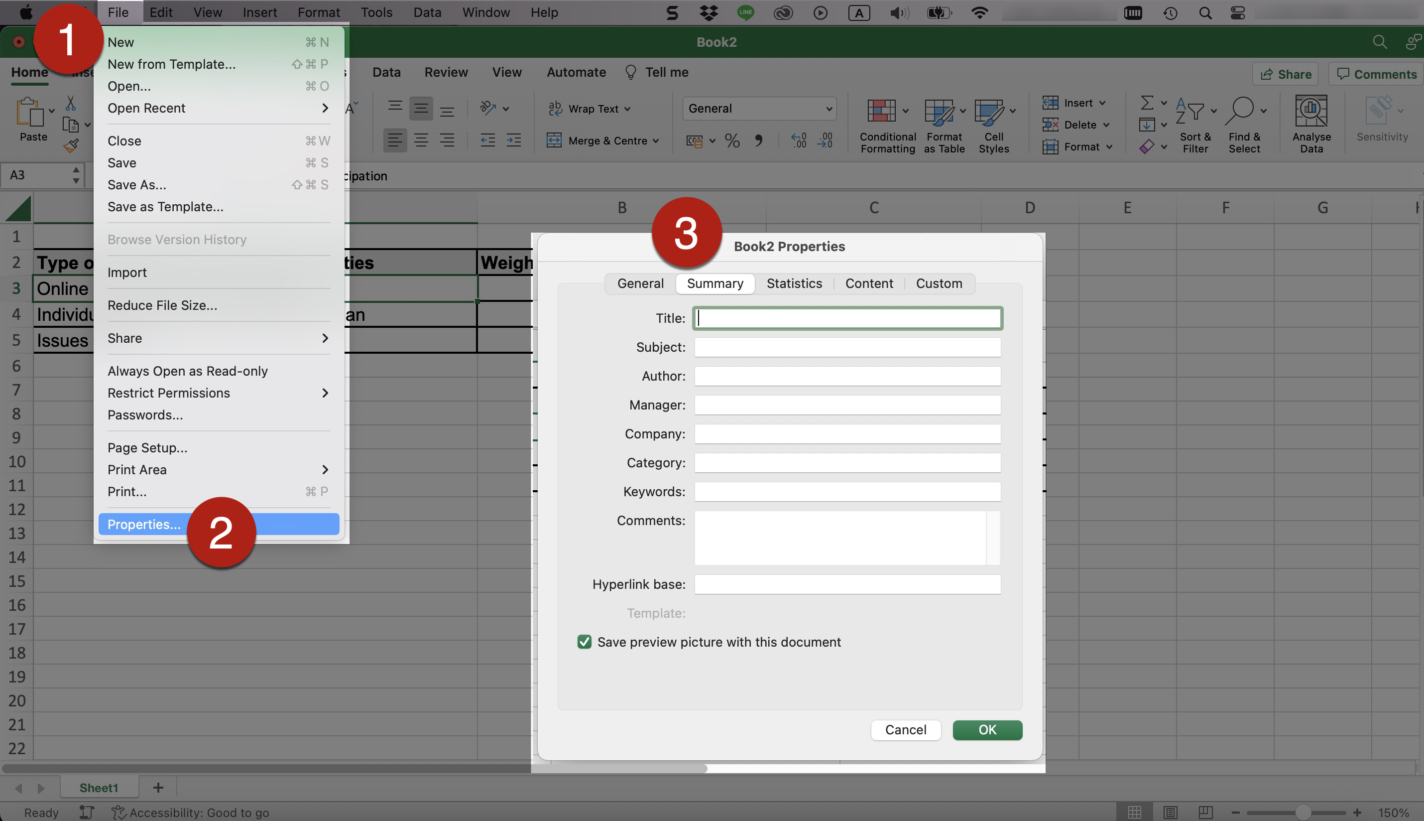
- Edit the file information, such as title, author, and keywords, of the document. It could facilitate users to identify and search the document.
- To edit the file information:
- Go to File > Properties.
- Select Summary in the Properties dialog box. Edit the file information in the corresponding fields, e.g., title and keywords.
- Keywords could make it easier for users to search for a file. For example, we can add the course code or keywords related to the Excel document.
- The built-in Accessibility Checker in Microsoft Excel can automatically detect some potential inaccessible designs of the document, such as missing Alt Text, and provide suggestions for fixing the potentially problematic areas.
- To run the built-in checker:
- Go to Review tab > Check Accessibility.
- Make use of the commands in the Accessibility tab to fix the potentially problematic areas.

- Note that passing the check does not necessarily guarantee “full accessibility” but failing the check would mean there are some inaccessible features that needs to be addressed.
- Do not solely rely on the Checker for accessible documents.
- Be aware of the limitations of the built-in Accessibility Checker.
- For example, the Checker could not tell whether the information is conveyed using colour alone.
- References: Rules for the Accessibility Checker in Microsoft.
- Try going through the document with screen readers. Examples of screen readers are:
- Narrator in Windows, built-in voiceover function in Windows.
- VoiceOver on Mac, built-in voiceover function in Mac.
- NVDA, screen reader that can be downloaded free of charge; available for computers running Microsoft Windows 7 SP1 and later.
- NVDA add-on developed by the Hong Kong Blind Union with a Chinese speech engine.
- Check the document control and content order accessed by keyboard users by going through the document using only the keyboard.
- Test for any problems with the content when the document or the screen is magnified to around 200%.
- Test whether the content is responsive to different screen size and mobile devices.