Enhancing accessibility of infographics and flyers

Table of Contents

Introduction

  • Infographics or flyers could provide visual presentation of complex information to serve different purposes in teaching and learning activities, such as:
    • Distribution and promotion of events such as workshops, seminars, conferences.
    • Recruitment of research participants.
    • Publication of research findings and information for public education.
    • Illustration of complicated or abstract concepts or models.
    • Step-by-step demonstration of certain topics and skills.
  • In this section, there are some recommended practices of creating accessible infographics and flyers. These practices are not exhaustive or definitive. There are many software and programmes for designing infographics and flyers, such as Microsoft PowerPoint, Microsoft Publisher, Canva, and Adobe InDesign. Their accessibility-related functions may vary across the programme versions, operating systems, and/or hardware. The principles would still apply regardless of the types of authoring tools are used.
  • It is important to note that software and computer programmes are constantly and rapidly developing along with changing accessibility functions. Refer to the specific authoring tools for the latest status of accessibility-related functions.
  • It is always good to consider the contexts as well as the diverse characteristics and needs of the target audience of the infographics and flyers. Modify the graphics design in response to their needs accordingly.
  • Size and dimension
    1. Be aware of the size, dimension, and device compatibility.
  • Content structure
    1. Structure content in logical reading order.
  • Inclusive content
    1. Be mindful of inclusive language and disability representation.
  • Use of colour
    1. Ensure sufficient colour contrast.
    2. Do not use colour as the sole visual cue.
  • Text formatting
    1. Use selectable text instead of image of text.
    2. Use plain language and keep content concise.
    3. Use appropriate font, font size, punctuation.
    4. Avoid capitalizing all text.
  • Hyperlinks
    1. Include any hyperlinks in QR codes in transcripts.
    2. Use descriptive link text for hyperlinks in transcripts.
  • Transcript and file sharing
    1. Disseminate graphics and transcripts together.
    2. Ensure graphics in PDF is tagged.

Size and dimension

  • If the size of the graphics is too large, the graphics might be blocked by the browsers by default. Users with limited access to Internet connection and/or limited data plans on mobile phone may not be able to download the graphics.
  • Be aware of whether the dimension of the graphics would be compatible with the screen size of across different devices, such as desktop computer and mobile phone.

Content structure

  • Structure the contents of the graphics with titles, headings, and logical reading order.
  • Ensure the reading order of the content is logical and aligns with the visual order.

Inclusive content

  • Use inclusive language. Avoid biased language.
  • Consider disability representation and diversity in mind.
  • Portray disabled people as ordinary people in society as they are. Do not create an impression of separateness, specialness, and dependence. Avoid focusing on their medical conditions.
  • Avoid portraying disabled people as a passive recipient of help from others.
    • For example, a student with visual impairment being helped to cross the road or the wheelchair of a wheelchair-using student being pushed by a fellow classmate.
  • Portray diversity. Show people with disabilities in everyday social situations and campus environment.
    • For example, a picture shows a group of students walking around the campus may include students with diverse characteristics to represent the inherent diversity, e.g., disability and skin colour.
  • Avoid emphasizing too much on some people with disabilities who have “remarkable achievements” as role models through storytelling.
    • Storytelling approach is often used to “inspire” others by conveying the idea of “see how these people with disabilities can overcome barriers with a never-give-up attitude and complete this and that” to motivate people without disabilities to try harder.
    • The hidden agenda is that if people with disabilities can achieve their goals, then surely can people without disabilities. It might also put much pressure on students with disabilities to think that they have to be an “inspiration” to matter. Mind the issues of possibly manifesting “inspiration porn”.
    • Inspiration porn is the stereotypical portrayal of people with disabilities doing something ordinary as “inspirational” solely or in part on the basis of their disabilities (Stella Young, 2014).
    • After all, the accomplishments of people with disabilities are worth celebrating on the basis of their competency (instead of their disability status) just as it is to celebrate the accomplishments of people without disabilities.

Use of colours

  • Make sure to check colour contrast. Content with sufficient colour contrast is easier for everyone to read. Content without sufficient colour contrast would be inaccessible to some users, particularly:
    • People who are colour blind;
    • People with visual impairment;
    • People viewing the graphics through monitors in bright sunlight or glare;
    • People viewing the graphics through a projector display in a well-lit venue.
  • Make use of software applications to check colour contrast. There is a number of colour contrast checkers that are free-of-charge.
    • Colour contrast is checked against the Web Content Accessibility Guidelines (WCAG) using these checkers. Enter the colours of the background and foreground (e.g., text), respectively. These checkers generally allow multiple methods of entering colours, such as the colour picker tool, RGB colour codes, or hex colour codes. The colour picker is particularly useful to users who are unfamiliar with colour codes. Then, the checkers will tell whether this colour combination would fulfil or fail the colour contrast requirements based on the WCAG Guidelines. If it fails, then it might suggest that we need to consider changing the colour of either the background or the foreground colours, or both. Otherwise, this colour combination might not be visually accessible to some readers. After we change the colours, re-do the check, until you get a combination that fulfils the accessibility requirement.
  • Examples of colour contrast checkers that are free-of-charge:
    • WebAIM Contrast Checker: An online checker.
    • WebAIM Link Contrast Checker: An online checker. It helps check the colour contrast between the link text, the surrounding body text, and the background colour.
    • Colour Contrast Analyser (CCA) from TPGi: It needs to be downloaded onto your computer, available for both Windows and Mac. It also provides a Color Blindness Simulator.
    • Adobe Colour Contrast Analyzer: An online checker. You may input the text colour and background colour values or upload a screenshot of your project to pick the colours you want to check for contrast. It will also recommend colours that would give better contrast. In the Accessibility Tools tab of the Adobe Colour Contrast Analyzer, apart from general colour contrast checker, you can choose the Colour Blind Safe Checker to check whether the colour theme or palette would be accessible for people with colour blindness.
  • Check whether the graphics are readable and the coloured text or diagrams are properly displayed in grayscale. It is useful and important practice because some users may print the infographics or flyers in black-and-white.
    • Examples of colour filters for checking grayscale display:
      • Windows Built-in colour filters: Go to Start > Settings > Ease of Access > Colour Filters. Switch on the toggle for colour filters.
      • Mac Built-in colour filter: Go to Apple menu > System Preferences > Accessibility > Display > Select Colour Filters > Select Enable Colour Filters > Select Grayscale in the dropdown menu. Then the grayscale filter will be applied to the entire screen.
    • Try selecting the other colour filters in the dropdown menu to view the graphics in simulated colour blindness situations. Fix any items in the graphics that do not present the intended meanings under colour filters.
  • Ensure sufficient colour contrast between the link text and/or URL; its surrounding body text, and the background.
  • Do not use “colour-on-colour” background and text. For example, light blue text on dark blue background.
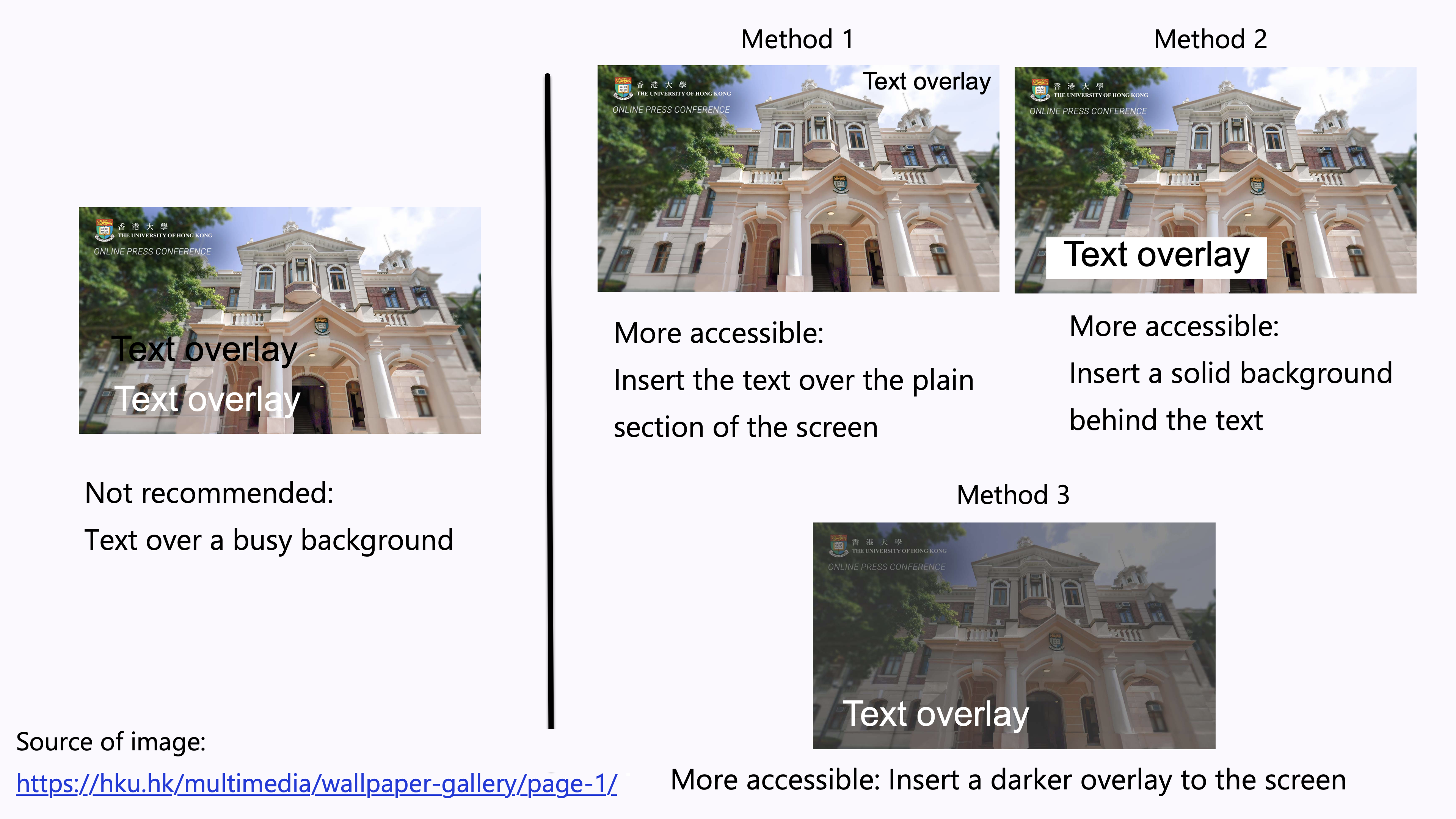
  • Avoid overlay text on a busy background.
    • Images usually consist of a wide range of colours. It could be difficult to ensure sufficient contrast between the colours in the background image and the text. It is difficult to read the overlaid text.
  • Examples of increasing the accessibility of the text overlay:
    • Method 1: Insert the text over the plain section of the photo. Ensure sufficient colour contrast between that section and the text.
    • Method 2: Insert a solid background behind the text. Ensure sufficient colour contrast between the solid background and the text.
    • Method 3: Insert a darker overlay to the image to increase the colour contrast between the background and the text.

Images comparing the not-recommended way of overlaying texts over a busy background, and the three more accessible methods to increase the accessibility of text overlay.

  • People with colour blindness, low contrast sensitivity, or some visual impairment, may have difficulty distinguishing between certain colours. Therefore, using colour as the only visual cue to convey important information could hinder understanding of the graphics content.
    • For example, a red “X” and a green “X” are used to represent “Compulsory lecture” and “Optional class” in the table, respectively. However, some users such as people with colour blindness may be unable to differentiate the red “X” and the green “X”. Users who print out the slides in grayscale may also be unable to differentiate the colours.
  • To enhance accessibility, use multiple visual cues to present information to enhance accessibility to wider range of users, especially graphics, tables, and charts, such as colour, pattern fill, line style (e.g., solid, or dotted lines), data labels, text description, and/or legend.
    • Example 1: Use both colour and descriptive text in the table, such as “Compulsory lecture” and “Optional class”, respectively.
    • Example 2: Use colour, pattern, and text labels, to identify each pie section of pie charts. Put the text labels near or directly on the corresponding pie section to enable readers to understand the chart clearly. Do not put all the text labels below the chart.Two sets of pie charts shown in colour and in greyscale. The set that uses colour as the sole visual cue is marked as less accessible, and the set that uses multiple visual cues is marked as more accessible.
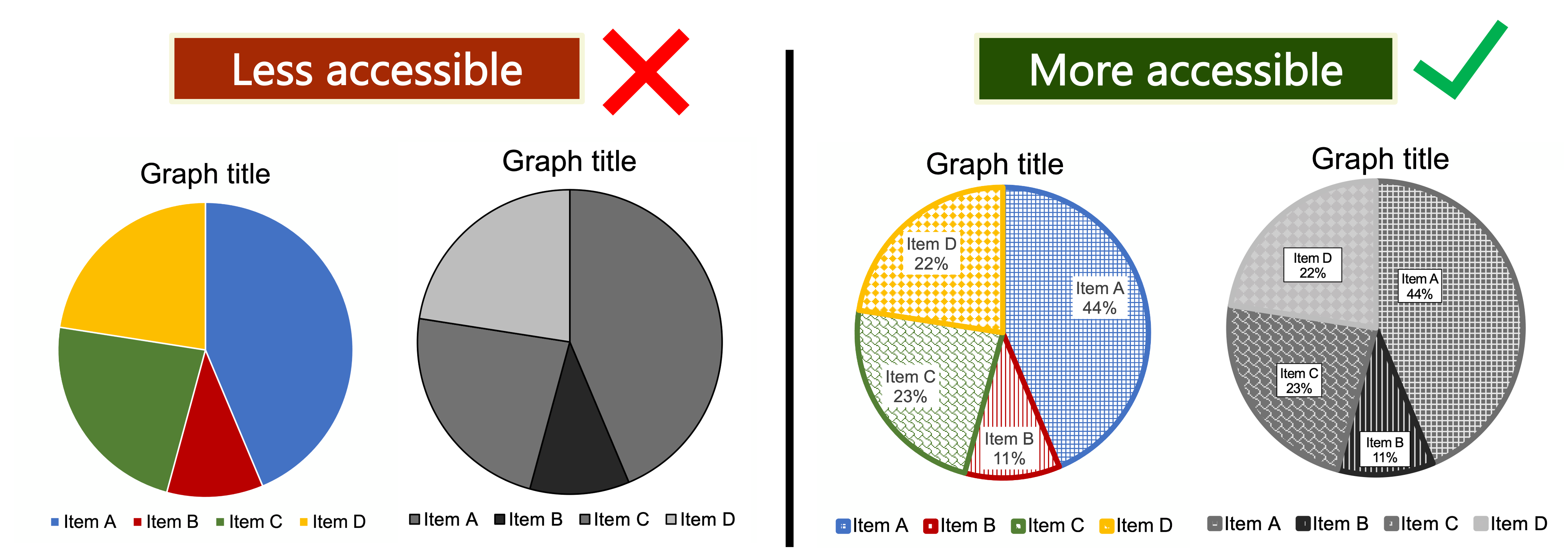
  • References: Charts & Accessibility. Pennsylvania State University
    • More examples of using multiple visual cues to present information in a more accessible way.

Text formatting

  • The text content in the graphics should be “real” to make the text selectable and searchable.
    • “Real” text means it is fully editable or selectable. The text can be selected and/or highlighted by cursor; copied and pasted. Searchable text means the text is searchable by shortcut keys such as Ctrl + F.
    • Assistive technologies such as screen readers can only access and process the real text in searchable PDF but not image of text.

Screenshots of two different PDFs. The one with only sentences highlighted has captions that read: “PDF document with ‘real’ text. The text can be selected, highlighted by cursor, or edited”. The screenshot with the entire page highlighted has captions that read: “Scanned image of text without ‘real’ text. The text cannot be selected, highlighted by cursor, nor edited”.

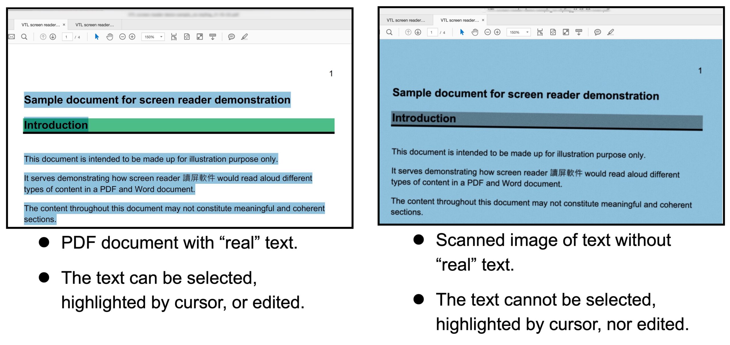
  • The text content should not be embedded in the graphics as an image of text.
    • The text in an image of text would get distorted and pixelated when the graphics are magnified, zoomed-in, or zoomed-out. It would particularly make the text inaccessible to users of magnifying tools.
    • For example, do not directly edit text on the “Shapes” in Microsoft PowerPoint. When this “Shape” is marked as decorative in the Alt Text pane, both the “Shape” and the text content on this “Shape” would not be interpreted by screen readers. The text content would get distorted and pixelated when the “Shape” is magnified, zoomed-in, or zoomed-out. It is suggested to insert a text box and the “Shape” as two separate layers.
  • Use plain language to promote understanding of the content by audience whose native language is different from the language used in the graphics.
  • Avoid many jargons.
  • Use more straight-forward language.
  • Avoid long and complicated sentences. Keep the text concise.
  • Make use numbered or bulleted lists to deliver the text.
    • Listed items could help everyone read and understand information more easily. People with dyslexia or cognitive impairments may find it difficult to understand large chunks of text.
  • Sans-Serif fonts, such as Arial, Calibri, and Verdana, are generally preferred to Serif fonts.
    • Sans-Serif font do not have decorative lines at the edge. An example is Arial.
    • Serif fonts have small lines at the edge that may hamper readability. Some users, especially people with dyslexia, might find it hard to read decorative fonts and those whose letters are close to one another. An example is Garamond.

Two capital letter A in Serif font and Sans-Serif font respectively, with circles that highlights the edges of the strokes and texts that reads: “Serif font examples: Times New Roman, Courier, and Baskerville”; “Sans-Serif font examples: Arial, Calibri, and Verdana”.

  • Avoid only decorative fonts or light fonts.
  • Use appropriate font size.
    • Appropriate font size can make the infographics and posters more comfortable and easier to read.
    • Some readers with visual impairment may need to use magnifiers to access the small texts in graphics. Larger font sizes could enhance accessibility.
    • Larger fonts would be more accessible for people with visual impairment. It also helps students sitting at the far end of classrooms or lecture halls.
  • Example of suggested font sizes of text for a digital poster that is around size A4:
    • Main title: 72 point (minimum) – 158 point (ideal)
    • Section headings: 42 point (minimum) – 56 point (ideal)
    • Body text: 24 point (minimum) – 36 point (ideal)
    • Captions: 18 point (minimum) – 24 point (ideal)
    • References: Academic Poster Resources: Accessibility. Yale University Library.
  • Use appropriate punctuation. Be aware of punctuation that visually looks similar but symbolize different meanings. Otherwise, it would make users assistive technologies such as screen readers difficult to understand the content.
    • For example, be aware of the differences between the marks of ” inches, ‘ feet, ’ apostrophe, “ ” quotation marks. Use the marks of “smart quotes” as the quotation marks. Do not use the marks of “straight quotes” as the quotation marks.
  • Avoid using all caps or small caps. It is difficult for most people to read.
  • Text with all caps or small caps may show no differences in the shapes of texts, and all the texts may visually appear a single “rectangle”. It would particularly create barriers to some people with visual impairment and some people with reading disabilities.

Hyperlinks

  • If there are any QR codes in the graphics that contains hyperlink, provide the URL full address and/or the link text for that URL in the transcripts. Screen reader users would not be able to click or activate the URL in the graphics.
  • Do not include the URL only in the Alt Text of the QR codes. Screen reader users would not be able to click or activate the URL in Alt Text.

Transcript and file sharing

  • Common formats of infographics and flyers are images and PDF files. However, because infographics and flyers are rich in visual information, they would inherently present accessibility barriers to users with visual or cognitive disabilities. Some users may be unable to access the information. It would hinder equal opportunities of participation in the teaching and learning activities. It is important to provide a transcript.
  • Transcripts are the text version of the content conveyed by the infographics and flyers. The information conveyed by the transcripts and the associated graphics should be equivalent. Users should be able to receive the same information if they access either the graphics or transcripts alone.
    • Transcript could be read aloud by screen readers for users or converted to Braille to enhance accessibility.
    • Transcript could benefit users with limited access to Internet connection and/or limited data plans on mobile phone which could not support downloading the graphics.
    • Transcript could benefit users when the graphics do not load successfully and/or the browsers block graphics by default
    • Transcript could facilitate users of language translation function.
    • Transcript could improve the search engine optimization of the graphics to enable the graphics to potentially reach more people.
  • Disseminate the graphics and transcripts together.
  • Ensure accessibility of the content and dissemination method of the transcript. Follow the accessibility practices for the corresponding file format, such as Word document, PDF, or webpage.
    • Sans-Serif fonts, such as Arial, Calibri, and Verdana, are generally preferred to Serif fonts.
    • Use appropriate font size.
    • Structure the transcript by adding headings.
    • Use descriptive link text for hyperlinks in transcripts.
  • If the graphics include any dialogue, the transcripts should indicate the “speakers” of the dialogue.
  • Avoid providing transcript as long alternative text (Alt Text) for the graphics.
  • For any acronym in the Alt Text and/or image description to be read aloud letter-by-letter (such as “I” – “D” – “E” – “A”) instead of as a word (such as “IDEA”), the letters in the acronym could be spaced out (such as “I D E A”) to enable assistive technologies such as screen readers to read it letter-by-letter.
  • It is important that infographics or flyers disseminated in PDF format should be tagged. A properly tagged PDF does not necessarily mean the PDF is fully accessible. However, an untagged PDF would not be accessible.
    • Tags are essential for screen reader users to access the PDF documents. The tags will form a logical and expandable tree structure that allows assistive technologies such as screen readers to identify each element in the PDF and read the content correctly in the intended and logical order.
  • Any text content in the PDF should be “real” to make the PDF searchable. The infographics PDF should not be an image of text. Assistive technologies such as screen readers can only access and process the real text in searchable PDF but not image of text.
    • “Real” text means it is fully editable or selectable. The text can be selected and/or highlighted by cursor; copied and pasted. Searchable PDF means the text is searchable by shortcut keys such as Ctrl + F.
    • Searchable PDF is indeed more accessible to all users as they can more easily select, highlight, edit, or reflow the real text content in the PDF.
  • Ensure the reading order of the content is logical and aligns with the visual order.
  • Follow the recommended accessibility practices for PDF.