- Simple or “’blank” themes are generally preferred to complicated designs. Simple themes generally have fewer potential accessibility issues.
- If there are any theme templates specified by your departments or institution, do your best to check accessibility of these theme templates before using these themes, such as colour contrast. In case there are any potential accessibility issues, do your best to report these issues to relevant units and select a more accessible theme.
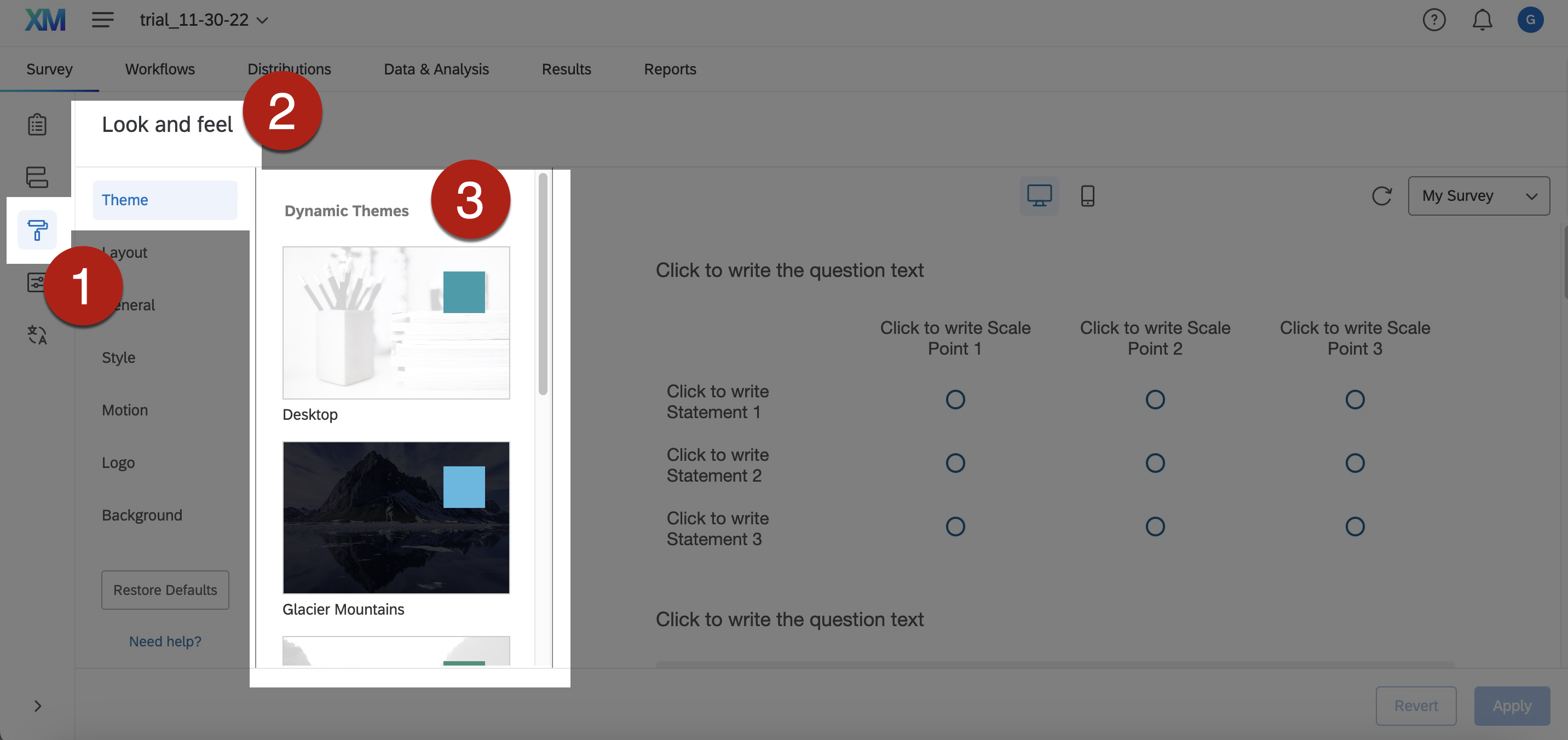
- To select theme in Qualtrics, go to Look and Feel > Theme > Select the theme you want.
- A customized and descriptive survey title can help users identify the survey. It is particularly useful to screen reader users as they would read the survey title in the browser tabs to identify and locate the target survey.
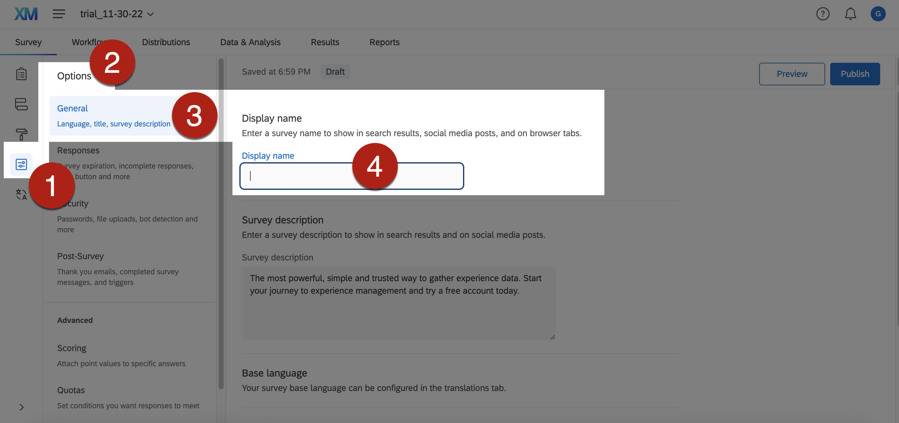
- To add customized survey title in Qualtrics:
- Go to Survey > Survey Options > General > Display Name.
- Enter your survey title in the Display Name
- The survey title appears in the browser tab.
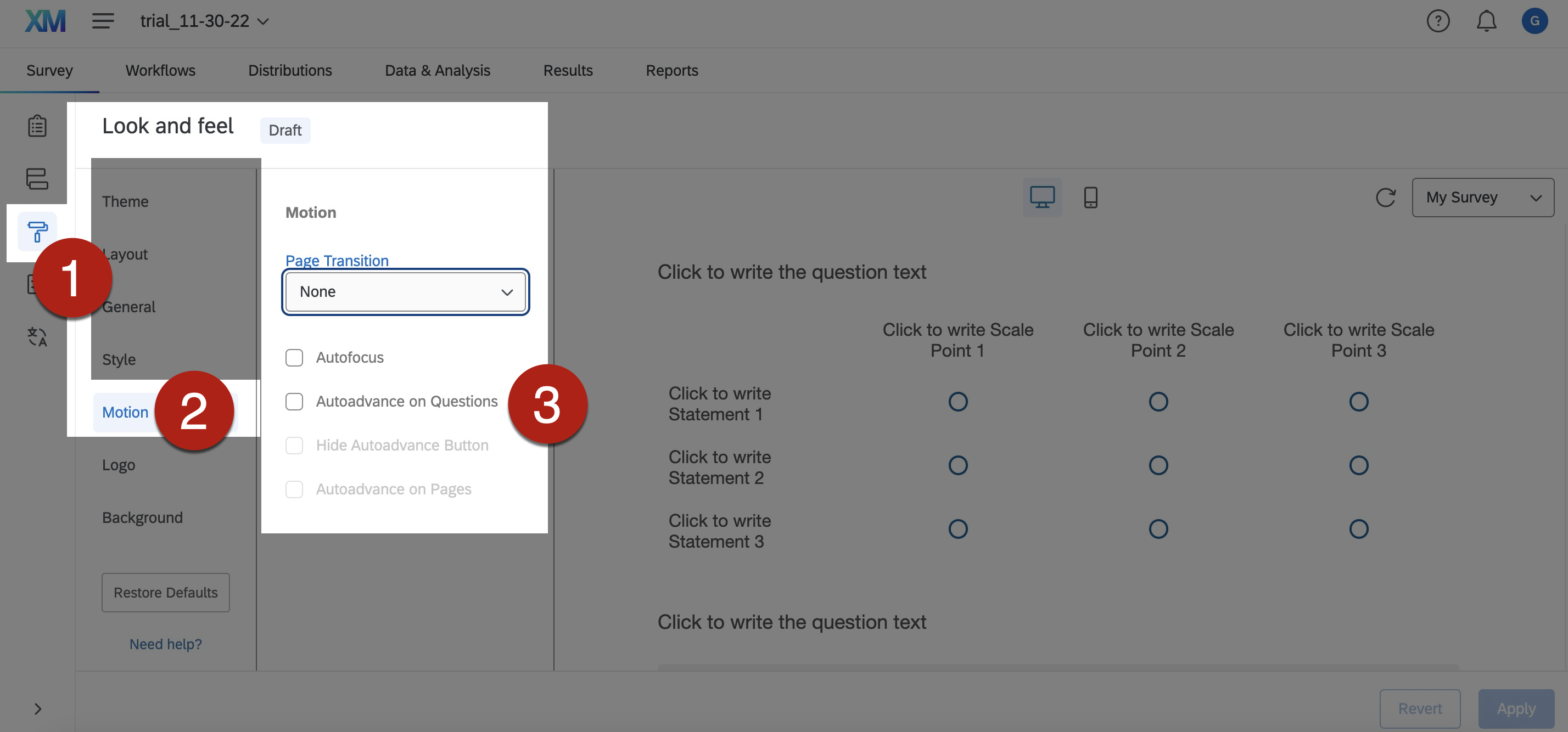
- Use simple page transition. Complicated page transition could be distracting.
- To set simple page transition:
- Go to Survey > Look and Feel > Motion > Page Transition. Select None from the dropdown menu of Page Transition.
- Qualtrics offer a wide range of question types to suit different survey purposes. However, some of the question types are potentially inaccessible to some users such as screen reader users.
- Always select accessible question types. Avoid potentially inaccessible question types.
- Try workarounds strategies for inaccessible question types to modify your originally intended ways of asking the questions to make them more accessible.
- References: Workarounds for inaccessible question types in Qualtrics. University of Colorado Boulder.
- It is important to note that software and computer programmes are constantly and rapidly developing along with changing accessibility functions. Always refer to the latest guidelines of the accessibility of different question types in Qualtrics when you create surveys.
- Accessible question types in Qualtrics that are WCAG 2.0 AA compliant:
- Descriptive text
- Multiple choice (all types)
- Net promoter® score
- Matrix (only rank order, constant sum, text entry, and profile; and be sure to set the matrix table to mobile-friendly)
- Text entry (all types)
- Rank order (only text box, graphic, and radio buttons)
- Side by side
- Constant sum (only choices, a.k.a text entry)
- Drill down
- Timing
- Meta info
- Captcha verification (V2)
- Slider
- Non-accessible question types in Qualtrics that do not meet WCAG 2.0 AA compliance:
- Matrix (likert, bipolar, MaxDiff, and carousel, as well as any matrix table that is drag and drop)
- Rank order (Drag and drop and select box)
- Constant sum (sliders and bars)
- Pick, group, and rank
- Hot spot
- Heat map
- Graphic slider
- Signature
- Highlight
- File upload
- Org hierarchy (EX)
- It may take different amount of time for each respondent to answer each question in a survey. Sometimes, some respondents might be unfamiliar with the survey interface, so it might take them some time to answer the questions. It is also possible that the loading of the questions takes some time due to limited Internet bandwidth and/or browser types. Timed questions may create stress to respondents that may bring about negative user experience.
- Avoid timed questions unless it is the necessary purpose of the survey, such as some psychological research on decision-making topics.
- If the survey contains some timed questions, it is suggested to mention the presence of timed questions early at the beginning of the survey to let respondents prepare for it.
- A visual display of a timer might facilitate some respondents to anticipate the amount of time remaining for answering questions. However, be aware that the timer might not be accessible to assistive technologies users such as screen reader users. The animation of a timer might be disturbing to some respondents.
- To display the timer for timed questions in Qualtrics:
- Go to Edit question > Question type > Timing > Timer settings > Show timer > Timer direction. Select either Count up or Count down for the timer.
- References: Timing Options in Qualtrics.
- It becomes more and more common for respondents to complete surveys using mobile devices. Therefore, it is essential to ensure mobile-friendly designs of the survey content.
- Make use of the mobile preview function in Qualtrics and the mobile compatibility advisor in Qualtrics to help check and fix design for the mobile compatibility of the survey content.
- Be aware that some questions involving JavaScript may not work properly across different devices.
- The layout of some question types such as Matrix Table, Slider, and Side by Side may require further consideration for better mobile view compatibility.
- Refer to the Qualtrics webpage on Mobile Survey Optimization for details.
- Include an introductory section at the welcoming page of the survey. Examples of suggested content include:
- Purpose of the survey
- Instructions of how to complete the survey, e.g., any required items, or any “survey logic” applied to the items.
- Contact methods of the person-in-charge of the survey, e.g., research project investigator.
- Availability of any alternative formats of the survey for respondents with different access needs, e.g., sign language version, PDF forms or Word version, along with the contact methods for further assistance.
- If “survey logic” settings are applied to the survey, some items may pop up or be skipped due to those “survey logic” settings. These unexpected contents may be confusing to screen reader users. It is important to notify users that the survey item order may or may not follow sequentially as expected as they proceed through the survey. It helps users understand that the survey is running properly, and they do not miss any items.
- Showing question numbers would help respondents keep track of the question order and survey completion progress as they proceed.
- To show question numbers:
- Go to Survey Options > General > Question numbers > Turn On this option. The question number will display next to each question in the survey.
- To use the auto-number feature:
- Go to Survey > Tools > Auto-number questions. A dialog pane opens.
- In the dialog pane, select the desired prefix and type of auto-numbering in Qualtrics that would suit the needs of your survey. Refer to Qualtrics website for details about the numbering options.
- Select the option Skip Export Tags that I have defined if you want to keep any specified question numbers for certain questions. The term “Export Tags” means question numbers. For example, the originally default numbering is “Q1, Q2, Q3…” and so on, but you want to rename the number “Q1” as “Introduction” to become “Introduction, Q2, Q3…” and so on.
- To hide the display of question number of individual questions:
- Select and click on the question concerned.
- Go to Question behavior > JavaScript.
- The Edit Question JavaScript dialog pane opens. Copy and paste the following string on the addOnReady section:
- jQuery(“#”+this.questionId+” .ExportTag”).hide();
- Select Save.
- Note that this method does not skip the question from the auto-numbering. It only hides the question number.
- Sometimes, instructional texts or graphics items that do not solicit any actual response may not need question numbering.
- To skip certain questions from the auto-numbering and hide the question number of these questions at the same time:
- Go to Survey Options > General > Question numbers > Turn On this option.
- Select and click on the questions concerned.
- Go to Question behavior > JavaScript.
- The Edit Question JavaScript dialog pane opens. Copy and paste the following string on the addOnReady
- jQuery(“#”+this.questionId+” .ExportTag”).hide();
- Repeat step 2 to 4 for each question concerned.
- Click and drag all the questions concerned to the end of the questions.
- Run auto-numbering. Go to Survey > Tools > Auto-number questions. Select the option Skip Export Tags that I have defined. The term “Export Tags” means question numbers.
- Click and drag those questions concerned back to their original positions within the list of questions.
- However, note that the question numbers would not reorder automatically in response to the survey logic. If “survey logic” settings are applied to the survey, some items may pop up or be skipped due to those “survey logic” settings. These unexpected contents and non-sequential question numbers may be confusing to some respondents such as screen reader users. It is important to notify users by adding different instructional text at the beginning of the survey, and/or within the corresponding questions, based on the context. It helps users understand that the survey is running properly, and they do not miss any items.
- Example 1: “Due to the use of survey logic, the survey question order may not follow sequentially as you expected as you proceed through the survey”
- Example 2: “If you answer ‘Yes’ to this question, two additionally follow-up questions will appear”
- Example 3: “If you answer ‘No’ to this question, the questions will be skipped to the question numbered 25”
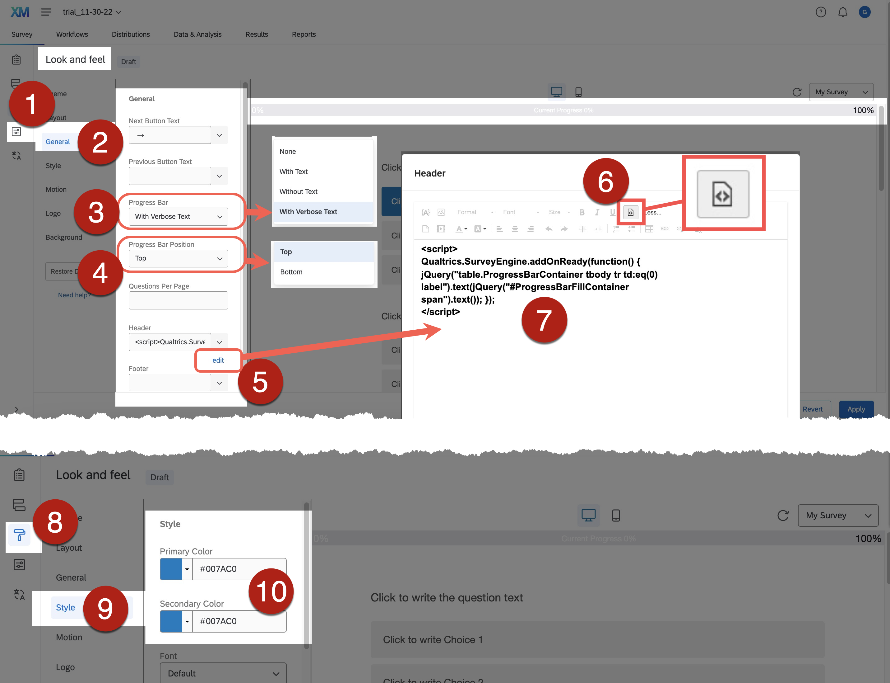
- Showing a progress bar would help respondents keep track of the survey completion progress as they proceed.
- The default style of the progress bar is a coloured bar moving forward with or without showing 0% and 100% at the extreme (left and right) of the progress bar. A verbose text of “Current Progress” might display within the bar as well. The coloured bar moves forward as respondents proceed through the survey. The default style of the progress bar might be inaccessible to some respondents such as people with visual impairment, people with colour blindness, and screen reader users.
- To add descriptive text and numerical percentage description to the progress bar as the respondents proceed through the survey:
- Go to Survey > Look and Feel > General > Progress Bar. Select With Verbose Text from the dropdown menu of Progress Bar.
- With Text: Showing only 0% and 100% at the extreme of the bar.
- Without Text: Showing only the moving bar, not even showing 0% or 100% at the extreme of the bar.
- With Verbose Text: Showing 0% and 100% at the extreme of the bar, along with the text Current Progress on the bar.
- Go to Progress Bar Position. Select either Top or Bottom from the dropdown menu.
- If you select Top as the progress bar position in step 2, the text description Current Progress and percentage would be shown within the progress bar.
- If you select Bottom as the progress bar position in step 2, the text description Current Progress and percentage would be shown above the progress bar.
- Insert JavaScript to either the Header or the Footer to add numerical percentage description to the progress bar.
- If you select Top as the progress bar position in step 2, go to the Header field to edit the JavaScript.
- If you select Bottom as the progress bar position in step 2, go to the Footer field to edit the JavaScript.
- Click edit of either the Header or the Footer Go to the < > (Source) field. Copy and paste the following script to the < > (Source) editing field.
- <script> SurveyEngine.addOnReady(function() { jQuery(“table.ProgressBarContainer tbody tr td:eq(0) label”).text(jQuery(“#ProgressBarFillContainer span”).text()); }); </script>
- Source of the JavaScript: The Qualtrics community forum post on “Is it possible to display progressive percentages as respondents are answering?”
- Click Save.
- Numerical percentage description will be added to the text description Current Progress along with the moving bar as the respondents proceed through the survey, in addition to the 0% and 100% at the extreme of the bar.
- Make sure to check and set sufficient colour contrast between the progress bar, the font colour, and the background. To modify the colour, go to Look and Feel > Style > Primary Color. Pick the desired colour.
- References: Colors of survey in Qualtrics
- Go to Survey > Look and Feel > General > Progress Bar. Select With Verbose Text from the dropdown menu of Progress Bar.
- Avoid enabling auto-advance questions. Respondents may want to re-read the questions and/or revise their response even after they have already responded to the question.
- To switch off the function of auto-advance questions:
- Go to Survey > Look and Feel > Motion. Uncheck the option Autoadvance on Questions.
- Response requirements and validation settings are commonly used to alert respondents about any survey items that they have missed and/or any wrong types of responses. Examples are Force Response, Request Response, and Content Validation. However, be aware that the presentation style of these notifications may not be accessible to some respondents such as screen reader users and people with colour blindness.
- If the Force Response setting is applied, any the items that respondents have missed will be highlighted by a coloured box, with an error message “Please answer this question” on top of the box. Respondents are not allowed to proceed unless they answer those items. Although the problematic items are highlighted by a coloured box, it might be difficult for screen reader users to locate those highlighted items.
- To improve accessibility of the Force Response notification:
- Clearly write the instructional text such as “This question is required” at the end of question text.
- Make sure to check and set sufficient colour contrast between the highlighted box, the font colour, and the background.
- Select an appropriate colour for highlighted box that gives sufficient colour contrast between the font colour and the background. To select the colour of these highlighted boxes, go to Look and Feel > Style > Primary Color. Pick the desired colour.
- If the Request Response setting is applied, any the items that respondents have missed will be highlighted by a coloured box, with a popup message dialog box. In the popup box, there is an alert message “There is unanswered question on this page. Would you like to continue?”. Respondents must select and click on the command either “Continue Without Answering” or “Answer the Question” on the popup dialog box before they can proceed. Although the problematic items are highlighted by a coloured box, it might be difficult for screen reader users to locate those highlighted items. The popup dialog box may or may not be accessible to screen reader users.
- To improve accessibility of the Request Response notification:
- Clearly write the instructional text such as “There might be popup message dialog boxes as you proceed to notify any items you have missed” at the beginning of the survey. It would help respondents to have a better idea about how to complete the survey and anticipate any potential barriers. Provide contact methods in case respondents think that the survey might be inaccessible to them and want to contact the survey creators.
- Make sure to check and set sufficient colour contrast between the highlighted box, the font colour, and the background.
- Select an appropriate colour for highlighted box that gives sufficient colour contrast between the font colour and the background. To select the colour of these highlighted boxes, go to Look and Feel > Style > Primary Color. Pick the desired colour.
- If the Content Validation setting is applied, responses that do not follow the specified formats or types will be highlighted by a coloured box, with an error message such as “Please enter a valid date of the form: mm/dd/yyyy” on top of the box (e.g., instead of the format “dd/mm/yyyy”). Respondents are not allowed to proceed unless they follow the specified formats or types in answering these items. Although the problematic items are highlighted by a coloured box, it might be difficult for screen reader users to locate those highlighted items.
- To improve accessibility of the Content Validation notification:
- Clearly write the instructional text about the required format of answers such as “Please enter a valid date of the form: mm/dd/yyyy” within the question text.
- Make sure to check and set sufficient colour contrast between the highlighted box, the font colour, and the background.
- Select an appropriate colour for highlighted box that gives sufficient colour contrast between the font colour and the background. To select the colour of these highlighted boxes, go to Look and Feel > Style > Primary Color. Pick the desired colour.
- References:
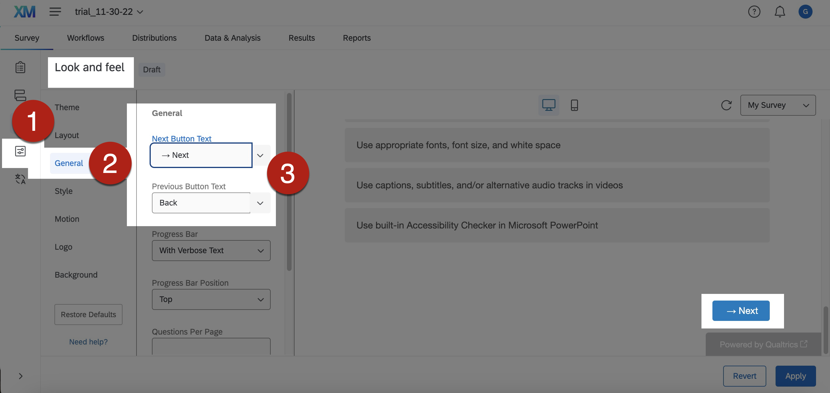
- There are different navigation buttons in Qualtrics to perform different functions, such as “move to next page”. However, the default style of the navigation buttons use mainly arrow symbols (such as “→”) to indicate the actions.
- It is suggested to use text indicate the actions of the navigation buttons. The text description should be concise, descriptive, and does not solely depend on visual cues.
- To add text description to navigation button:
- Go to Survey > Look and Feel > General.
- Input the desired text description in the fields of Next Button Text and/or Previous Button Text. Examples are “Next”, “Back”, “→ Next”, are “← Back”. Select Apply to save the changes.
- Make sure to check and set sufficient colour contrast between the font colour and the button background colour. To modify the colour of the navigation buttons, go to Look and Feel > Style > Secondary Color. Pick the desired colour.
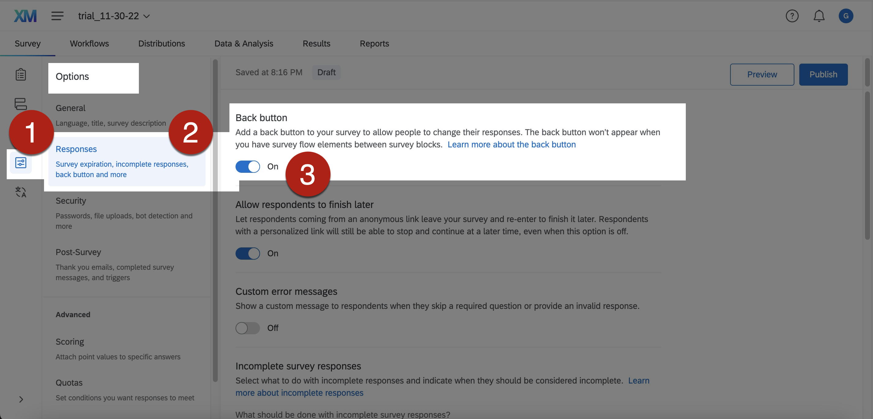
- Respondents may want to make review and change their answers to the previous questions as they proceed through the survey.
- The Back button allows respondents to change their responses to previous questions. It could make respondents less stressed when filling in the survey.
- To enable the Back button:
-
- Go to Survey > Survey Options > Responses > Back button. Switch On the Back button.
- Add text description to navigation button. Go to Survey > Look and Feel > General. Input the desired text description in the fields of Previous Button Text. Examples are “Back” or “← Back”. Select Apply to save the changes.
- Make sure to check and set sufficient colour contrast between the font colour and the button background colour. To modify the colour of the navigation buttons, go to Look and Feel > Style > Secondary Color. Pick the desired colour.
- The Submit button can let respondents know clearly that they are reaching the end of the survey. It also alerts respondents that it will be final opportunity to go back to previous questions and review or edit their answers.
- To create the Submit button:
-
- Add a Block at the bottom of the survey.
- Click and drag the question or questions that are intended to appear on the final page of the survey to this final Block.
- Select and click on this final Block. Go to Edit Block pane > Format > Next/Previous button text.
- The button text editing pane Input “Submit” in the Next Button Text field. Click Save.
- Make sure to check and set sufficient colour contrast between the font colour and the button background colour. To modify the colour of the navigation buttons, go to Look and Feel > Style > Secondary Color. Pick the desired colour.
- References: Making a Submit Button in Qualtrics.
- Avoid capitalizing all text. It is difficult for most people to read.
- Avoid using all caps and small caps.
- Do not make use of all caps to emphasize text content, screen readers might not be able to identify this purpose.
- Text with all caps or small caps may show no differences in the shapes of texts, and all the texts may visually appear a single “rectangle”. It would particularly create barriers to some people with visual impairment and some people with reading disabilities.
- Sans-Serif fonts, such as Arial, Calibri, and Verdana, are generally preferred to Serif fonts.
- Sans-Serif font do not have decorative lines at the edge. An example is Arial.
- Serif fonts have small lines at the edge that may hamper readability. Some users, especially people with dyslexia, might find it hard to read decorative fonts and those whose letters are close to one another. An example is Garamond.
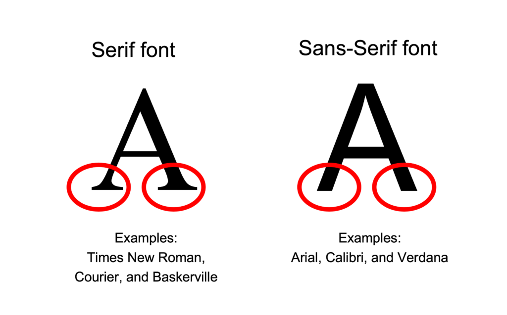
- Some fonts may not be available in most of the common computer systems. For example, Helvetica is a recommended Sans-Serif font. It is available on Mac but not Windows. Be aware that Helvetica text may or may not displayed as Helvetica style in different computers as intended.
- Avoid only decorative fonts or light fonts.
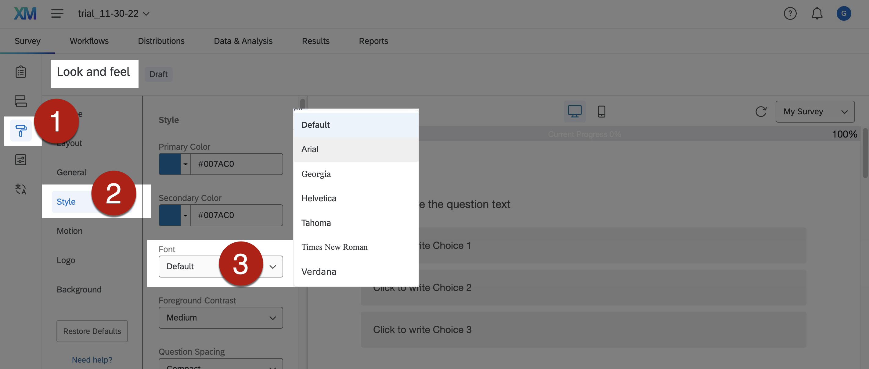
- To change the font used in Qualtrics:
- Go to Survey > Look and Feel > Style > Font. Select the desired font from the dropdown menu of Font.
- Appropriate font size can make the survey content more comfortable and easier to read.
- Larger fonts would be more accessible for people with visual impairment.
- Avoid having extremely large and small texts in the same survey.
- Ensure the proportion of font sizes within the same survey. Some readers may need to magnify the survey. They may get lost in the texts with extreme font sizes after magnifying the survey.
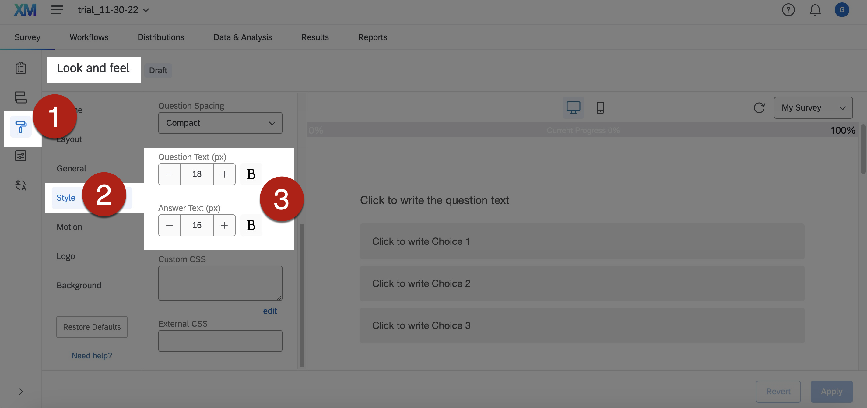
- To change font size in Qualtrics:
- Go to Survey > Look and Feel > Style > Font. Input the desired font size at the Question Text and Answer Text, respectively.
- Recommend at least 20px for the question text and 18px for the answer text.
- Ensure sufficient contrast between the background and the text content to facilitate reading.
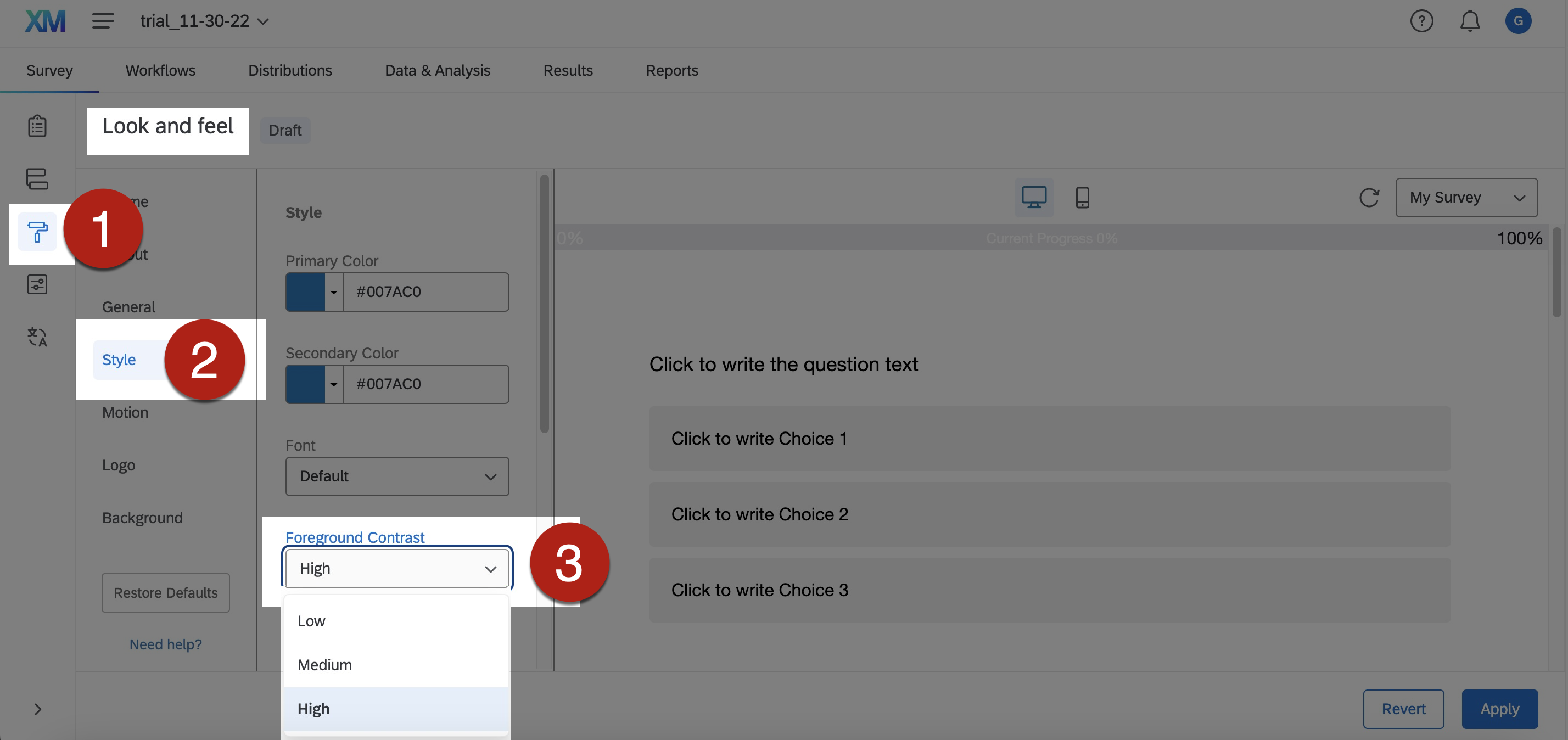
- To set high contrast mode in Qualtrics:
- Go to Survey > Look and Feel > Style > Foreground Contrast. Select High from the dropdown menu of Foreground Contrast.
- Left-justified text is generally more readable.
- The uneven spacing between the words in full justified text could make readers difficult to follow and understand the text.
- Avoid long and complicated sentences. Divide long body of text into different sections.
- To select left justification of text in Qualtrics, go to the Rich Content Editor of the text.
- References: Formatting Rich Text in Qualtrics.
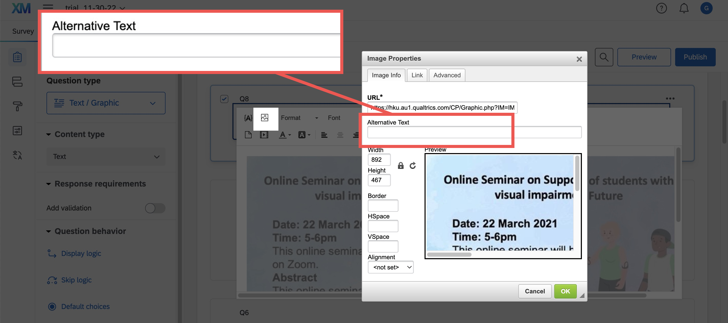
- Alternative text (“Alt Text”) concisely describes the content and the purposes of the graphical content in brief phrases or 1-2 sentences.
- Alt Text enables users of assistive technologies to understand graphical content. When screen readers recognize an image with Alt Text, screen readers will read “Image” or “Graphic” followed by reading the associated Alt Text.
- Sighted users generally do not see the Alt Text. However, when images do not load successfully and/or the browsers block images by default, Alt Text of that image may display to let users know what the image is about. Sighted users would also see the Alt Text under this situation even if they are not using assistive technologies.
- To insert Alt Text in Qualtrics:
- Insert the image into the Rich Content Editor.
- Select and right-click on the image. Select Image Properties from the dropdown menu.
- Enter the Alt Text of the image in the Alternative Text field. Click OK.
- Graphical content that are purely for visual decorative purposes, for formatting purposes (such as stylistic borders), repetitively used, or do not provide meaningful information do not require Alt Text. Currently there is no option of “Mark as decorative image” in Qualtrics. You may consider writing “Decorative” as the Alt Text instead. Screen readers users will understand that this image is decorative, and they do not miss important information.
- In general, no need to begin the Alt Text with phrases such as “Picture of…” or “Image of…” When screen readers recognize an image with Alt Text, screen readers will read “Image” or “Graphic” followed by reading the associated Alt Text.
- Do not write detailed and lengthy description of complex graphical content as Alt Text. Consider providing the lengthy description within the question text. It helps every user understand complex graphical content, not only screen reader users.
- Include the informative text embedded within the graphical content in the Alt Text.
- Be aware that hyperlinks in the Alt Text cannot be activated or presented by link text.
- Use punctuation such as periods to end the Alt Text. Otherwise, screen readers may mix up the Alt Text and the main body text that follows. It may confuse the users.
- For any acronym in the Alt Text and/or image description to be read aloud letter-by-letter (such as “I” – “D” – “E” – “A”) instead of as a word (such as “IDEA”), the letters in the acronym should be spaced out (such as “I D E A”) to enable assistive technologies such as screen readers to read it letter-by-letter.
- Further guidelines for writing Alt Text and image descriptions:
- Alternative Text. WebAIM.
- Documentation Screen Captures. Pennsylvania State University.
- Flowcharts & Concept Maps. Pennsylvania State University.
- Image Description Guidelines (Art, Chemistry, Diagrams, Flow Charts, Formatting & Layout, Graphs, Maps, Mathematics, Page Layout, Tables, Text-only images). The DIAGRAM Center.
- Best Practices for Accessible Images. California State University, Northridge.
- Effective Practices for Description of Science Content within Digital Talking Books. The WGBH National Center for Accessible Media.
It covers guidelines for writing image descriptions for bar chart, line graph, Venn diagram, scatter plot, table, pie chart, flow chart, standard diagrams or illustrations, and complex diagrams or illustrations. - NWEA Image Description Guidelines for Assessments (PDF; 5.6 MB). The Carl and Ruth Shapiro Family National Center for Accessible Media at WGBH (NCAM).
It cover discussion about challenges and guidelines for writing image descriptions for a variety of images, charts, and graphics targeted to the assessment of reading, language usage, science, and mathematics. - Excerpts from the NBA Tape Recording Manual, Third Edition. National Braille Association.
Instruction and examples of describing complex images.
- Provide subtitles, transcripts, and audio descriptions for video and audio. Audio description provides narration of the key visual elements in the video.
- If you embed the subtitles in the video file directly, make sure the font, font size, and colour contrast of the text and background are accessible and easy to read.
- If you really cannot provide subtitles and/or transcripts of the video or audio, you need to mention this issue in the question text to notify the respondents.
- Sometimes you may consider providing the URL of the video or audio in the question text in case the embedded video or audio does not work properly within the Qualtrics interface.
- Make sure to check colour contrast. Content with sufficient colour contrast is easier for everyone to read. Content without sufficient colour contrast would be inaccessible to some users, particularly:
- People who are colour blind;
- People with visual impairment;
- People viewing the survey through monitors in bright sunlight or glare;
- People viewing the survey through a projector display in a well-lit venue.
- Make use of software applications to check colour contrast. There is a number of colour contrast checkers that are free-of-charge.
- Colour contrast is checked against the Web Content Accessibility Guidelines (WCAG) using these checkers. Enter the colours of the background and foreground (e.g., text), respectively. These checkers generally allow multiple methods of entering colours, such as the colour picker tool, RGB colour codes, or hex colour codes. The colour picker is particularly useful to users who are unfamiliar with colour codes. Then, the checkers will tell whether this colour combination would fulfil or fail the colour contrast requirements based on the WCAG Guidelines. If it fails, then it might suggest that we need to consider changing the colour of either the background or the foreground colours, or both. Otherwise, this colour combination might not be visually accessible to some readers. After we change the colours, re-do the check, until you get a combination that fulfils the accessibility requirement.
- Examples of colour contrast checkers that are free-of-charge:
- WebAIM Contrast Checker: An online checker.
- WebAIM Link Contrast Checker: An online checker. It helps check the colour contrast between the link text, the surrounding body text, and the background colour.
- Colour Contrast Analyser (CCA) from TPGi: It needs to be downloaded onto your computer, available for both Windows and Mac. It also provides a Color Blindness Simulator.
- Adobe Colour Contrast Analyzer: An online checker. You may input the text colour and background colour values or upload a screenshot of your project to pick the colours you want to check for contrast. It will also recommend colours that would give better contrast. In the Accessibility Tools tab of the Adobe Colour Contrast Analyzer, apart from general colour contrast checker, you can choose the Colour Blind Safe Checker to check whether the colour theme or palette would be accessible for people with colour blindness.
- Ensure sufficient colour contrast between the link text and its surrounding body text. Ensure the colours of the not-yet-visited hyperlinks and visited hyperlinks show sufficient contrast against the background colours, respectively.
- An example of online checker for link texts: WebAIM Link Contrast Checker.
- Do not use “colour-on-colour” background and text, such as light blue text on dark blue background.
- Check whether the coloured content are properly displayed in grayscale.
- Examples of colour filters for checking grayscale display:
- Windows Built-in colour filters: Go to Start > Settings > Ease of Access > Colour Filters. Switch on the toggle for colour filters.
- Mac Built-in colour filter: Go to Apple menu > System Preferences > Accessibility > Display > Select Colour Filters > Select Enable Colour Filters > Select Grayscale in the dropdown menu. Then the grayscale filter will be applied to the entire screen.
- Try selecting the other colour filters in the dropdown menu to view the content in simulated colour blindness situations. Fix any parts that do not present the intended meanings under colour filters.
- Examples of colour filters for checking grayscale display:
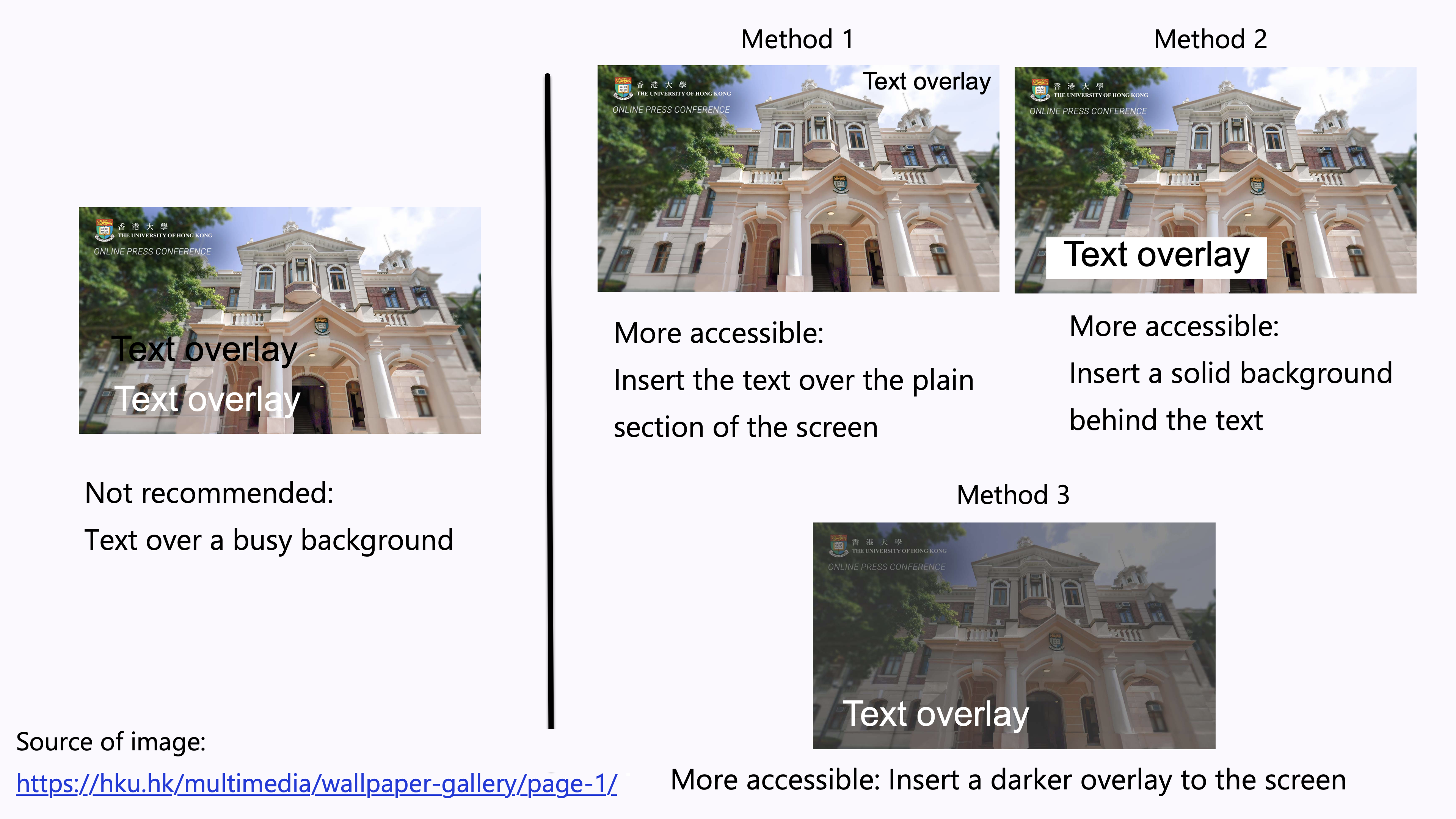
- Avoid overlay text on a busy background.
- Images usually consist of a wide range of colours. It could be difficult to ensure sufficient contrast between the colours in the background image and the text. It is difficult to read the overlaid text.
- Examples of increasing the accessibility of the text overlay:
- Method 1: Insert the text over the plain section of the photo. Ensure sufficient colour contrast between that section and the text.
- Method 2: Insert a solid background behind the text. Ensure sufficient colour contrast between the solid background and the text.
- Method 3: Insert a darker overlay to the image to increase the colour contrast between the background and the text.
- Do not only rely on visual location, shape, size, or colour to present instructions in the survey. For example, avoid using “Refer to the options below”, “Compare the object on the left and the one on the right”, or “Select the button on the left”.
- It would create barriers to some respondents such as people with visual impairment, people with colour blindness, and screen reader users.
- Sometimes, the survey content layout might be automatically resized and/or repositioned when it is displayed in different devices, such as computers, mobile phones, and tablets, in response to monitor size. The visual location of certain content of the survey may be inconsistent across devices or browsers.
- People with colour blindness, low contrast sensitivity, or some visual impairment, may have difficulty distinguishing between certain colours. Therefore, using colour as the only visual cue to convey important information could hinder understanding of the survey.
- For example, a red “X” and a green “X” are used to represent “Compulsory lecture” and “Optional class” in the table, respectively. However, some users such as people with colour blindness may be unable to differentiate the red “X” and the green “X”. Users who print out the slides in grayscale may also be unable to differentiate the colours.
- To enhance accessibility, use multiple visual cues to present information to enhance accessibility to wider range of users, especially graphics, tables, and charts, such as colour, pattern fill, line style (e.g., solid, or dotted lines), data labels, text description, and/or legend.
- Example 1: Use both colour and descriptive text in the table, such as “Compulsory lecture” and “Optional class”, respectively.
- Example 2: Use colour, pattern, and text labels, to identify each pie section of pie charts. Put the text labels near or directly on the corresponding pie section to enable readers to understand the chart clearly. Do not put all the text labels below the chart.
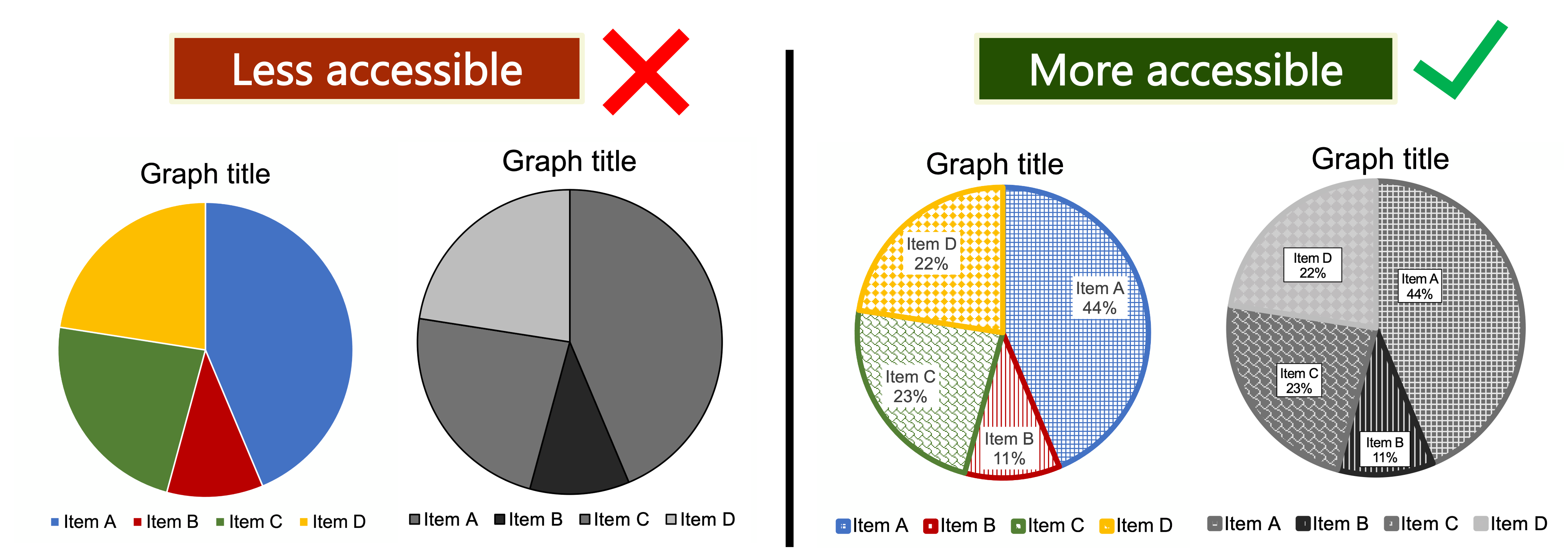
- References: Charts & Accessibility. Pennsylvania State University.
- More examples of using multiple visual cues to present information in a more accessible way.
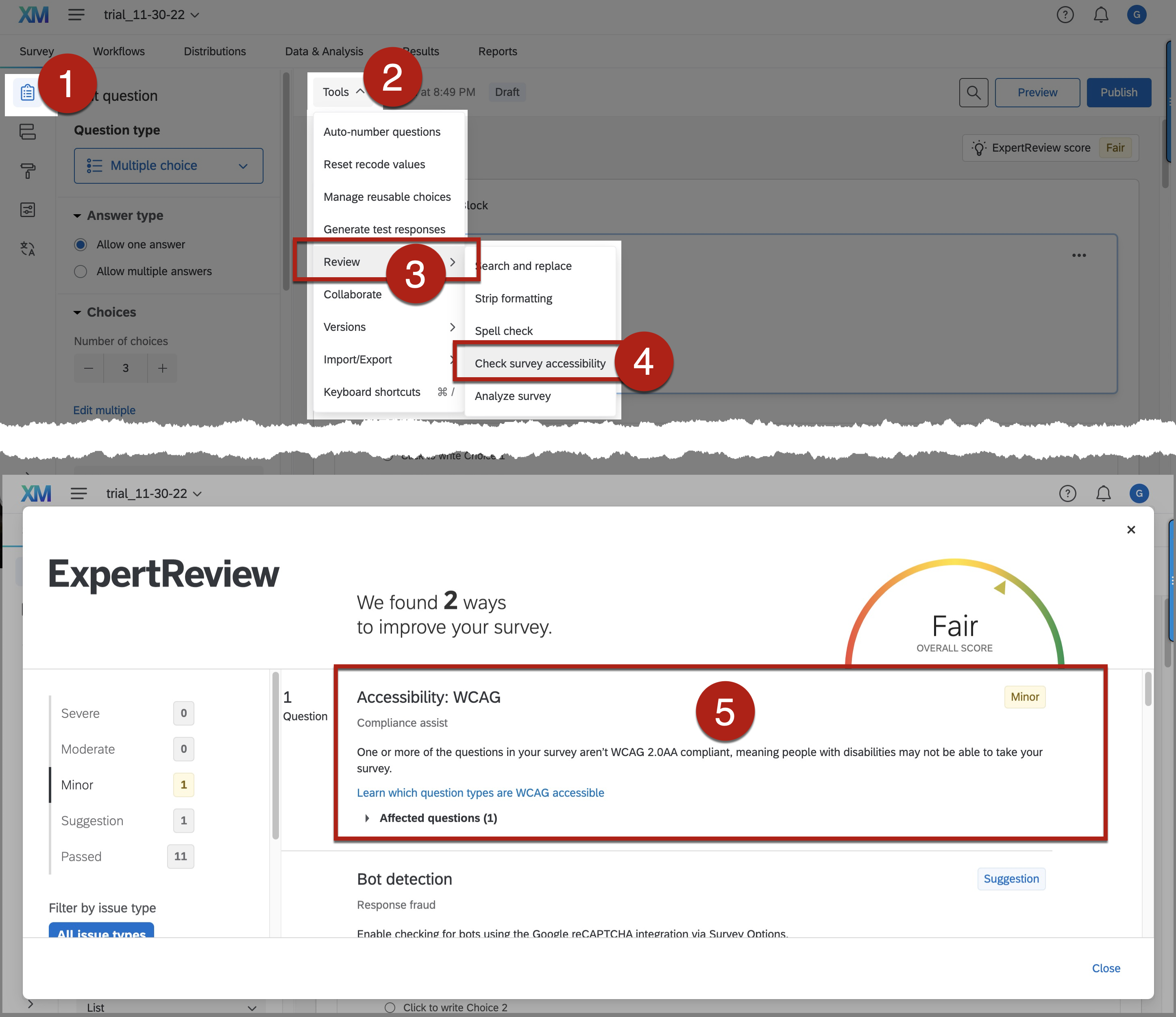
- The built-in Accessibility Checker in Qualtrics can automatically detect some potential inaccessible designs of the survey and provide suggestions for fixing the potentially problematic areas.
- To use the built-in Accessibility Checker in Qualtrics:
-
- Go to Survey > Tools > Review > Check survey accessibility > Accessibility: WCAG
- The Accessibility: WCAG section will list out some potential accessibility issues in the survey design and suggested solutions.
- Note that passing the check does not necessarily guarantee “full accessibility” but failing the check would mean there are some inaccessible features that needs to be addressed. Do not solely rely on this checker for accessible survey. Be aware of the limitations of the built-in Accessibility Checker. For example, the Checker would not inspect colour contrast, font, font size, and keyboard-use accessibility. Manual testing is needed.
- References: Using the Check Survey Accessibility Tool in Qualtrics.
- Go through the survey preview and the published version with keyboard only. Check the keyboard accessibility of the survey settings and the reading order the survey content. Try if you can navigate through the whole survey using only the TAB Key and/or the up or down arrow Keys of the keyboard. Try also if you can select answers to questions using the Enter Key or other keys of the keyboard, such as multiple-choice questions.
- Go through the survey preview and the published version with screen readers to check the accessibility of the survey settings and the reading order the survey content. The same approach also applies to the mobile view of the survey. Below are examples of screen readers.
- Narrator in Windows, built-in voiceover function in Windows.
- VoiceOver on Mac, built-in voiceover function in Mac.
- NVDA, screen reader that can be downloaded free of charge by everyone; available for computers running Microsoft Windows 7 SP1 and later.
- NVDA add-on developed by the Hong Kong Blind Union with a Chinese speech engine.