Enhancing accessibility of website content

Table of Contents

Introduction

  • Website creation becomes more and more common in higher education. Researchers may make use of websites for dissemination of research deliverables and knowledge exchange with the community. Some teaching units may create course-specific websites to engage prospective students.
  • It is important to consider accessibility from the beginning of the design process of the websites to better cater for the needs of the target users to the greatest extent possible. It is always important to collect users’ opinions and conduct user testing on the accessibility of the prototypes and final product of the websites.
  • There might be varying extent of restricted access to certain website hosting at some geographical locations. Be aware that some users may not be able to access the websites due to such restriction in access.
  • In this section, there are examples of fundamental principles of creating accessible website content, but they are not exhaustive or definitive. Please be sure to refer to the Web Content Accessibility Guidelines (WCAG) to know more about the best practices and technical detail of designing accessible websites.
  • Web Content Accessibility Guidelines (WCAG)
    1. Follow Web Content Accessibility Guidelines (WCAG).
  • Content structure
    1. Format lengthy content into sections with headings.
    2. Balance the use of text and graphics.
  • Inclusive content
    1. Be mindful of inclusive language and disability representation.
  • Text formatting
    1. Use appropriate font, punctuation, spacing, alignment.
  • Hashtags and emojis
    1. Use camel case hashtags.
    2. Use emojis and emoticons appropriately.
  • Use of colour
    1. Ensure sufficient colour contrast.
    2. Do not use colour as the sole visual cue.
  • Graphics
    1. Provide alternative text (“Alt Text”) for graphics.
    2. Create transcripts for infographics.
  • Audio-visual content
    1. Avoid animation, GIFs, or flashing content.
    2. Provide accessible video and audio.
    3. Avoid default autoplay of media.
  • Hyperlinks
    1. Include any hyperlinks in QR codes in the posts.
    2. Use descriptive link text for hyperlinks.
  • Support for visitors
    1. Provide contact information for visitors’ enquiry.
  • Device compatibility
    1. Ensure compatibility across different devices.
  • Accessibility check
    1. Conduct accessibility test on the website.

Web Content Accessibility Guidelines

Content structure

  • Structure lengthy webpage content into meaningful paragraphs or sections with headings.
  • A well-formatted and meaningful heading structure could let users quickly know what each section is about. Users could jump between headings to look for information from large piece of content efficiently. Some people may have only given a quick glance on the website to look for certain information. Users could decide which part to read by judging from the headings. It may facilitate information processing and memory for many users.
  • Users of assistive technologies such as screen readers and keyboard-control may navigate the webpage efficiently by jumping between headings. Without heading structure, they may need to go through the whole webpage every time they want to look for certain piece of content.
  • Give a meaningful and descriptive heading to each section. Keep headings concise, specific to the section, and clear to someone new to the topic. A concise heading would be useful to Braille display users. Refreshable Braille display may present up to 80 characters at a time.
  • Format the headings using the appropriate codes in creating the website.
    • Only these coded headings can be identified by screen readers.
    • Note that while headings created by manually applying font sizes, colours, and/or bold to the text may make the text visually appear to be a heading, these “headings” could not be recognized by screen readers as true “headings”.
  • Make sure to follow the heading hierarchy in logical order starting from Heading 1 to Heading 6 and so on. Do not skip heading levels.
  • References:
  • Graphics, like photos or icons, may convey information effectively. Icons may be used to facilitate users to understand the content. However, different users may have different interpretation of the graphics.
  • It is important to choose icons that share a common understanding among a wider range of users. For example, it would be common to use a “trash can” icon to represent the operation of “deleting”.
  • Sometimes, it is possible that the webpages cannot be loaded properly due to issues such as limited Internet connection or device incompatibility, users may not be able to access the graphic content.
  • The Web Content Accessibility Guideline (WCAG) suggests avoiding using graphics when written content could present the same idea. It is preferred to use written text to express ideas because it is more compatible in different scenarios.

Inclusive content

  • Consider disability representation and diversity in mind.
  • Portray disabled people as ordinary people in society as they are. Do not create an impression of separateness, specialness, and dependence. Avoid focusing on their medical conditions.
  • Avoid portraying disabled people as a passive recipient of help from others.
    • For example, a student with visual impairment being helped to cross the road or the wheelchair of a wheelchair-using student being pushed by a fellow classmate.
  • Portray diversity. Show people with disabilities in everyday social situations and campus environment.
    • For example, a picture on the university website showing a group of students walking around the campus may include students with diverse characteristics to represent the inherent diversity, e.g., disability and skin colour.
  • Avoid emphasizing too much on some people with disabilities who have “remarkable achievements” as role models through storytelling or first-person sharing on website content.
    • Storytelling approach is often used to “inspire” others by conveying the idea of “see how these people with disabilities can overcome barriers with a never-give-up attitude and complete this and that” to motivate people without disabilities to try harder.
    • The hidden agenda is that if people with disabilities can achieve their goals, then surely can people without disabilities. It might also put much pressure on students with disabilities to think that they have to be an “inspiration” to matter. Mind the issues of possibly manifesting “inspiration porn”.
    • Inspiration porn is the stereotypical portrayal of people with disabilities doing something ordinary as “inspirational” solely or in part on the basis of their disabilities (Stella Young, 2014).
    • After all, the accomplishments of people with disabilities are worth celebrating on the basis of their competency (instead of their disability status) just as it is to celebrate the accomplishments of people without disabilities.

Text formatting

  • Sans-Serif fonts, such as Arial, Calibri, and Verdana, are generally preferred to Serif fonts.
    • Sans-Serif font do not have decorative lines at the edge. An example is Arial.
    • Serif fonts have small lines at the edge that may hamper readability. Some users, especially people with dyslexia, might find it hard to read decorative fonts and those whose letters are close to one another. An example is Garamond.

Two capital letter A in Serif font and Sans-Serif font respectively, with circles that highlights the edges of the strokes and texts that reads: “Serif font examples: Times New Roman, Courier, and Baskerville”; “Sans-Serif font examples: Arial, Calibri, and Verdana”.

  • Some fonts may not be available in most of the common computer systems. For example, Helvetica is a recommended Sans-Serif font. It is available on Mac but not Windows. Be aware that Helvetica text may or may not displayed as Helvetica style in different computers as intended.
  • Avoid only decorative fonts or light fonts.
  • Use 12-point or larger font size for the body text.
    • Appropriate font size can make the content more comfortable and easier to read.
    • Larger fonts would be more accessible for people with visual impairment.
  • Avoid having extremely large and small texts in the same piece of content.
    • Ensure the proportion of font sizes within the same piece of content. Some readers may need to magnify the screen for reading. They may get lost in the texts with extreme font sizes after magnifying the screen.
  • Avoid using all caps and small caps.
    • Text with all caps or small caps may show no differences in the shapes of texts, and all the texts may visually appear a single “rectangle”. It would particularly create barriers to some people with visual impairment and some people with reading disabilities.
  • Use appropriate punctuation. Be aware of punctuation that visually looks similar but symbolize different meanings. Otherwise, it would make users assistive technologies such as screen readers difficult to understand the content.
    • For example, be aware of the differences between the marks of ” inches, ‘ feet, ’ apostrophe, “ ” quotation marks. Use the marks of “smart quotes” as the quotation marks. Do not use the marks of “straight quotes” as the quotation marks.
  • Different assistive technologies may recognize symbols differently.
    • For example, some screen readers may recognize and/or read out the “ – ” symbol differently. Some screen readers may not understand whether the “ – ” symbol represents the meaning or function of “en dash”, “em dash”, “negative”, “minus”, or “hyphen”.
    • Consider spelling out the intended meaning or function of the symbol in text to avoid confusion. For example, write “25% to 50%” instead of “25% – 50%”; and write “A minus” instead of “A-”. Make a remark within the document to indicate the intended meaning or function of the symbols if needed.
  • Left justification is generally preferred to full justification.
    • Left-justified text is more readable. The uneven spacing between the words in full justified text could make readers difficult to follow and understand the text.
  • Avoid long and complicated sentences. Divide long body of text into different sections.
  • Introduce sufficient line spacing within the text. Avoid densely packed sentences. Line spacing may affect readability.
    • If the line spacing is too tight, the text lines would appear crowded and become harder to read. Sometimes, the characters between lines may even overlap.
    • If the line spacing is too large, the text lines would appear disconnected and unrelated, and become difficult to understand.
  • Introduce sufficient paragraph spacing within the text. Avoid densely packed paragraphs.
  • Do not insert indentation, paragraph spacing, or empty lines manually by pressing the Enter or Spacebar key.
    • While this is a common practice and makes the content appear to have the desired spacing, screen readers would read these empty lines created by Enter or Spacebar keys as “Blank”. If there are many spacing created in this way, users of screen readers would keep listening “Blank”. It can be very annoying and confusing to the users. They may also assume they have already reached the end of the content.
  • Use text editing tools to increase or decrease indent, instead of pressing the Spacebar key multiple times to create spaces.
  • Adjust the amount of space before and after lines of text to create the desired line spacing, paragraph spacing, and the spacing between headings and paragraphs, respectively, instead of pressing the Enter key.

Hashtags and emojis

  • Hashtags can be created for users to follow specific topics on websites and social media platforms such as Twitter and Instagram.
  • Adopt camel case in creating hashtags by capitalizing the first letter of each word and/or adding underscore in the multiple-word hashtags. An example is “#adoptcamelcase” versus “#Adopt_Camel_Case”.
    • It would enhance the readability of the hashtags for everyone. It would provide cue to people with dyslexia or cognitive disability to identify the word pattern and recognize the words in the hashtag.
    • It could give the cue that there are different words in the hashtag. Screen readers might be able to read aloud the hashtag as different words as intended. Without spaces between words in the same hashtag, there would be no cues for the screen readers to distinguish the separate words in the hashtags. The screen readers might turn out to read aloud the whole hashtag as one long word.
  • Do not use hashtags alone to convey important information.
  • Do not overuse hashtags in website content. Having too many hashtags within the same webpage would make audience difficult to understand the content.
  • Emojis and emoticons could help convey different emotions and create a more welcoming and friendly tone of the content.
  • Use emojis or emoticons to supplement words rather than replace them.
  • Do not use emojis and emoticons to convey important information. Add text description to help everyone understand the content if needed.
  • Each emoji has a default alternative text. Screen readers would read aloud the corresponding alternative text of each emoji.
    • Refer to Emojipedia which documents the descriptions and variation of emoji display across online platforms in the Unicode Standard.
  • Different computer operating systems may display the same emojis differently. It may cause differences in interpretation of the same information.
  • Do not overuse emojis or emoticons in website content. Having too many emojis within the webpage content would make it difficult to understand the content.
    • For example, the default alternative text for the emoji “😆” on Apple iOS system is “Grinning Squinting Face”. If a series of emoji “😆” is used continuously, such as “😆😆😆😆😆”, screen readers might read aloud as “Grinning Squinting Face, Grinning Squinting Face, Grinning Squinting Face, Grinning Squinting Face, Grinning Squinting Face”. It can be annoying and confusing to the users. It may disrupt the flow of reading and understanding.
  • Emoticons are generally created by combination of symbols, alphabets, and characters. Although the use of emoticons becomes more and more common, not everyone understand their meanings. The meanings of each emoticon may not be universal.
  • While sighted users could read and interpret the visual presentation of the emoticons as a whole directly, screen reader users may hear the components of an emoticon separately. It would be confusing to screen reader users and affect their understanding of the content.
    • For example, screen readers might read aloud the emoticon “ 🙂 ” as “semicolon parenthesis”; and “XD” as “X D” instead of the intended meaning of “laughing”.

Use of colours

  • Make sure to check colour contrast. Content with sufficient colour contrast is easier for everyone to read. Content without sufficient colour contrast would be inaccessible to some users, particularly:
    • People who are colour blind;
    • People with visual impairment;
    • People viewing the website through monitors in bright sunlight or glare;
    • People viewing the website through a projector display in a well-lit venue.
  • Make use of software applications to check colour contrast. There is a number of colour contrast checkers that are free-of-charge.
    • Colour contrast is checked against the Web Content Accessibility Guidelines (WCAG) using these checkers. Enter the colours of the background and foreground (e.g., text), respectively. These checkers generally allow multiple methods of entering colours, such as the colour picker tool, RGB colour codes, or hex colour codes. The colour picker is particularly useful to users who are unfamiliar with colour codes. Then, the checkers will tell whether this colour combination would fulfil or fail the colour contrast requirements based on the WCAG Guidelines. If it fails, then it might suggest that we need to consider changing the colour of either the background or the foreground colours, or both. Otherwise, this colour combination might not be visually accessible to some readers. After we change the colours, re-do the check, until you get a combination that fulfils the accessibility requirement.
  • Examples of colour contrast checkers that are free-of-charge:
    • WebAIM Contrast Checker: An online checker.
    • WebAIM Link Contrast Checker: An online checker. It helps check the colour contrast between the link text, the surrounding body text, and the background colour.
    • Colour Contrast Analyser (CCA) from TPGi: It needs to be downloaded onto your computer, available for both Windows and Mac. It also provides a Color Blindness Simulator.
    • Adobe Colour Contrast Analyzer: An online checker. You may input the text colour and background colour values or upload a screenshot of your project to pick the colours you want to check for contrast. It will also recommend colours that would give better contrast. In the Accessibility Tools tab of the Adobe Colour Contrast Analyzer, apart from general colour contrast checker, you can choose the Colour Blind Safe Checker to check whether the colour theme or palette would be accessible for people with colour blindness.
  • Ensure sufficient colour contrast between the link text and its surrounding body text. Ensure the colours of the not-yet-visited hyperlinks and visited hyperlinks show sufficient contrast against the background colours, respectively.
  • Check whether the webpages are properly displayed in grayscale and other colour filters that simulate colour blindness situations.
    • Examples of colour filters for checking display:
      • Windows Built-in colour filters: Go to Start > Settings > Ease of Access > Colour Filters. Switch on the toggle for colour filters.
      • Mac Built-in colour filter: Go to Apple menu > System Preferences > Accessibility > Display > Colour Filters > Enable Colour Filters > Select the colour filter in the dropdown menu. Then, the colour filter will be applied to the entire screen.
    • Try selecting the other colour filters in the dropdown menu to view the webpage in simulated colour blindness situations. Fix any parts in the webpage that do not present the intended meanings under colour filters.
  • Do not use “colour-on-colour” background and text, such as light blue text on dark blue background.
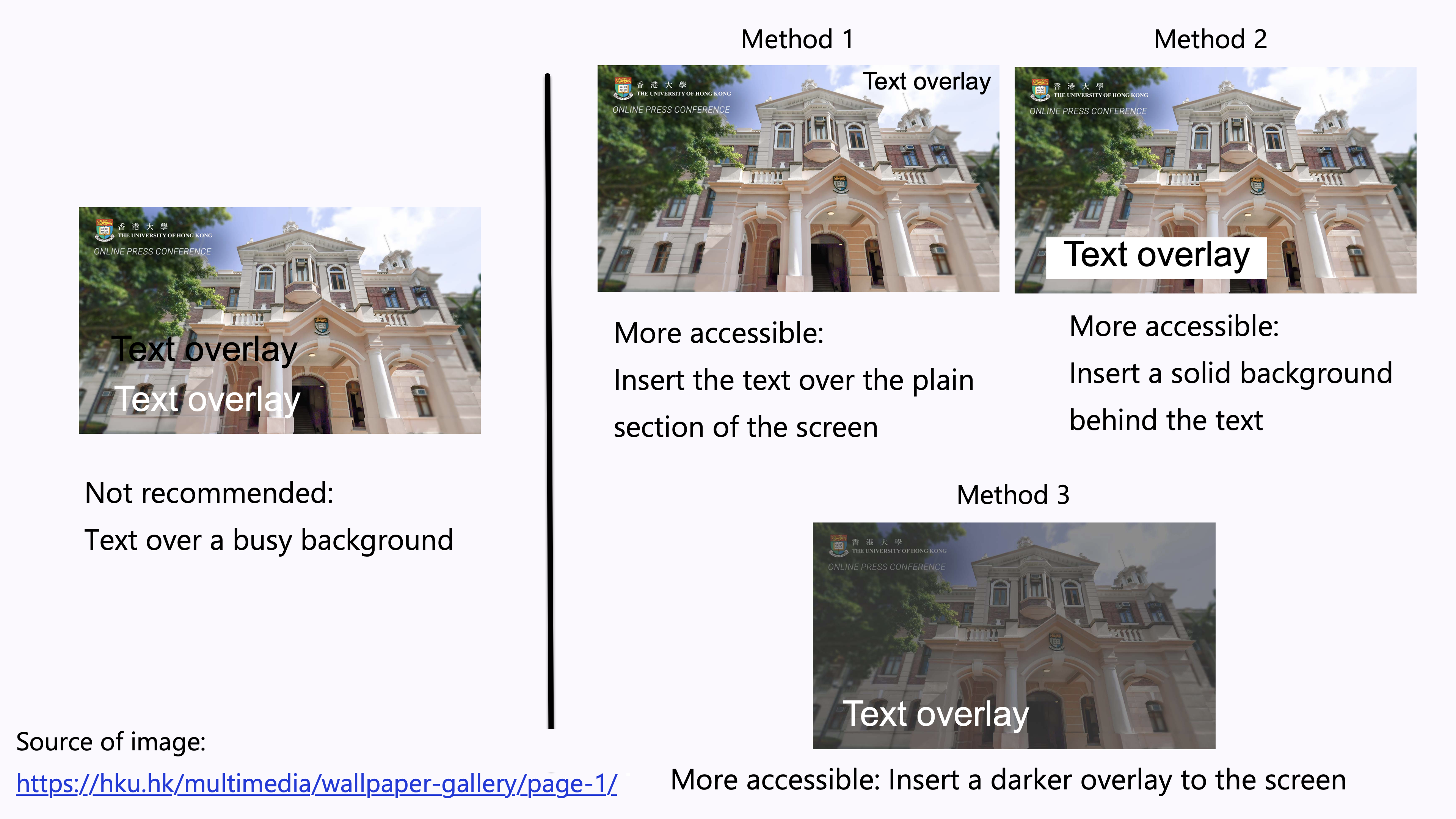
  • Avoid overlay text on a busy background.
    • Images usually consist of a wide range of colours. It could be difficult to ensure sufficient contrast between the colours in the background image and the text. It is difficult to read the overlaid text.
  • Examples of increasing the accessibility of the text overlay:
    • Method 1: Insert the text over the plain section of the photo. Ensure sufficient colour contrast between that section and the text.
    • Method 2: Insert a solid background behind the text. Ensure sufficient colour contrast between the solid background and the text.
    • Method 3: Insert a darker overlay to the image to increase the colour contrast between the background and the text.

Images comparing the not-recommended way of overlaying texts over a busy background, and the three more accessible methods to increase the accessibility of text overlay.

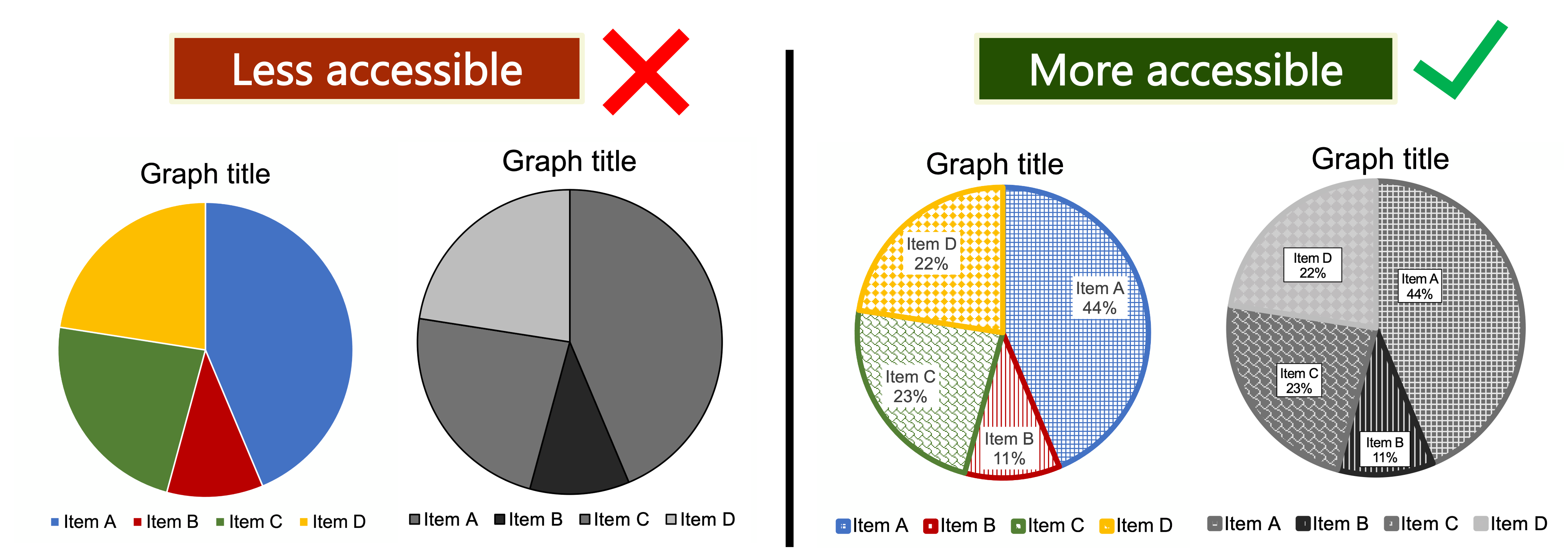
  • People with colour blindness, low contrast sensitivity, or some visual impairment, may have difficulty distinguishing between certain colours. Therefore, using colour as the only visual cue to convey important information could hinder understanding of the content.
    • For example, a red “X” and a green “X” are used to represent “Compulsory lecture” and “Optional class” in the table, respectively. However, some users such as people with colour blindness may be unable to differentiate the red “X” and the green “X”.
  • To enhance accessibility, use multiple visual cues to present information to enhance accessibility to wider range of users, especially graphics, tables, and charts, such as colour, pattern fill, line style (e.g., solid, or dotted lines), data labels, text description, and/or legend.
    • Example 1: Use both colour and descriptive text in the table, such as “Compulsory lecture” and “Optional class”, respectively.
    • Example 2: Use colour, pattern, and text labels, to identify each pie section of pie charts. Put the text labels near or directly on the corresponding pie section to enable readers to understand the chart clearly. Do not put all the text labels below the chart.Two sets of pie charts shown in colour and in greyscale. The set that uses colour as the sole visual cue is marked as less accessible, and the set that uses multiple visual cues is marked as more accessible.
  • References: Charts & Accessibility. Pennsylvania State University
    • More examples of using multiple visual cues to present information in a more accessible way.

Graphics

  • Alternative text (“Alt Text”) concisely describes the content and the purposes of the graphical content in brief phrases or 1-2 sentences. Examples of graphical content include photos, shapes, pictures, charts, SmartArt, and graphics.
  • Alt Text enables users of assistive technologies to understand graphical content. When screen readers recognize an image with Alt Text, screen readers will read “Image” or “Graphic” followed by reading the associated Alt Text.
  • Sighted users generally do not see the Alt Text. However, when images do not load successfully and/or the browsers block images by default, Alt Text of that image may display to let users know what the image is about. Sighted users would also see the Alt Text under this situation even if they are not using assistive technologies.
  • In general, no need to begin the Alt Text with phrases such as “Picture of…” or “Image of…”
    • When screen readers recognize an image with Alt Text, screen readers will read “Image” or “Graphic” followed by reading the associated Alt Text.
  • Include the informative text embedded within the graphical content in the Alt Text.
  • Be aware that hyperlinks in the Alt Text cannot be activated or presented by link text.
  • Use punctuation such as periods to end the Alt Text. Otherwise, screen readers may mix up the Alt Text and the main body text that follows. It may confuse the users.
  • For any acronym to be read aloud letter-by-letter (such as “I” – “D” – “E” – “A”) instead of as a word (such as “IDEA”), the letters in the acronym may be spaced out (such as “I D E A”) so assistive technologies such as screen readers would read aloud letter-by-letter.
  • Graphical content that are purely for visual decorative purposes, for formatting purposes (such as stylistic borders), repetitively used, or do not provide meaningful information generally do not require Alt Text.
  • Do not write detailed and lengthy description of complex graphical content as Alt Text, e.g., charts and graphs. Consider providing the lengthy description within the body text of the website content. It helps every user understand complex graphical content, not only screen reader users.
  • Further guidelines for writing Alt Text and image descriptions:
  • Provide both the infographics and the associated transcripts within the same webpage.
    • It would enhance the access for assistive technologies users, people with visual impairment, and/or users with limited Internet access which could not support downloading the infographics.
    • Display the full text of the transcript directly above, below, or next to the graphics whenever it is possible.
    • Use toggle to show or hide the transcript.
    • Provide a link to a file or webpage for the transcript.
    • Add a note of “Transcript follows the flyer” or “Refer to the attachment [or other specified location] for the transcript” to notify users if needed.
  • Transcripts are the text version of the content conveyed by the infographics.
  • The information conveyed by the transcripts and the associated infographics should be equivalent. Users should be able to receive the same information if they access either the graphics or transcripts alone. For example:
  • If the infographics include any dialogue, the transcripts should indicate the “speakers” of the dialogue.

Audio-visual content

  • Creative use of animation, GIFs, or flashing content may promote user engagement. Common examples of animations appearing on a website are slideshows, motion graphics and animated backgrounds. However, be aware of the use of animations or flashing objects.
  • Content that flashes more than three times per second may trigger unpleasant feelings, dizziness, nausea, or seizures in some people, such as people who are photosensitive.
  • According to the WCAG Success Criterion 2.3.1, websites should not contain “anything that flashes more than three times in any one second period”.
  • Animation, GIFs, or flashing content may distract some users from the main content, especially people who have difficulties in reading or concentrating.
  • Users of assistive technologies such as screen readers and magnifier may not be able to interpret the rapidly changing animated content in time before the content goes away.
  • Provide an option (e.g., “On Click”) to allow users to play, pause, or stop the autoplay of the flashing content, if possible. It allows users to read the content at their own pace or as they want to.
  • Do not convey important information solely by animation, GIFs, or flashing content. Provide Alt Text or caption.
  • Provide subtitles, transcripts, and audio descriptions for video and audio. Audio description provides narration of the key visual elements in the video. It makes the video more accessible to people with visual impairment.
  • Provide timestamps for different sub-sections of the video or audio for users’ easy navigation.
  • If you embed the subtitles in the video file directly, make sure the font, font size, and colour contrast of the text and background are accessible and easy to read.
  • If you really cannot provide subtitles and/or transcripts of the video or audio, you may mention this in the webpage to notify the users.
  • Avoid autoplay of media such as video and audio by default.
  • Unexpected content and default autoplay may be inaccessible to some users of assistive technologies such as screen readers.
  • Unexpected sound or flashing content may trigger seizures or discomfort in some people.
  • Unexpected sound may be shocking or distracting to some users.
  • If there will be sudden loud noise or any potentially triggering scenes in the media, mention this information in the webpage to alert the users. For example, users may want to turn down the volume of their earphones before playing the media file.
  • Allow users to control playback of the media at the own pace whenever it is possible. Users may want to re-visit certain parts of the media content at their own pace.

Hyperlinks

  • If there are any QR codes in the posts that contains hyperlink, provide the URL full address and/or the link text for that URL in the posts.
  • Do not include the URL only in the Alt Text of the QR codes. Screen reader users may not be able to click and activate the URL in Alt Text.
  • Users of assistive technologies such as screen readers users sometimes scan a list of hyperlinks in the webpage for effective navigation and understanding.
  • Screen readers would read aloud link text, such as “link, [link text], out of link”, to notify users that this is a hyperlink.
  • Do not simply use non-descriptive link text such as “Read more”, “More information here”, or “Click here” to present the hyperlink. It is important the link text is concise and give relevant information of the action and destination of the hyperlinks.
    • Screen readers would read it as “Read more, link” or “Click here, link”. It is confusing as it does not provide meaningful information of where or what the hyperlinks will take the users to and when used out of context.
  • The look of the link text should be visually different from other nonlinked text in the text. Usually, the link text is underlined and in blue.
    • Note that using colour alone to indicate link text would be inaccessible. It would create barriers to people with colour blindness.
  • Ensure sufficient colour contrast between the link text and its surrounding body text. Ensure the colours of the not-yet-visited hyperlinks and visited hyperlinks show sufficient contrast against the background colours, respectively.
  • Check that users can access the hyperlinks using multiple commands, e.g., the mouse, keyboard, or speech recognition systems.

Support for visitors

  • Provide contact information for visitors’ enquiry about any accessibility issues regarding the website.
  • Consider providing multi-modal of contact methods, such as email and phone call, to cater for diverse needs of users.
    • For example, providing phone hotline as the only contact method might be inaccessible to deaf or hard-of-hearing users.

Device compatibility

  • People may use different electronic devices to access websites, like laptop, tablet, or smartphone, maybe because it is the only device that they have for the moment, or they are more comfortable with using the certain device. There could be many reasons when people choose which device they want to use.
  • Test whether the website content, the controls, and navigations can function properly across operating systems, browsers, screen sizes, and devices, such as computers (e.g., Windows and Mac), mobile phones (e.g., Android and iOS), and tablets.
    • For example, websites should not be relying on mouse alone to expand a dropdown menu. This would not work on touch-screen devices.
  • Screen size and orientation of the devices may affect the display and readability of the website content. Make sure the website content would function properly in both portrait and landscape orientations.
  • Consider the variety of input devices and methods, such as touch gestures, mouse, external keyboard, and/or speech recognition control.
  • Set up access key shortcuts for browsing the website by manipulating the keyboard alone. Introduce the shortcuts on the webpage for users’ reference.

Accessibility check

  • Conduct user testing on the website. Try inviting people with disabilities through university’s student affairs unit, NGOs referral, open recruitment, or personal invitation, to share their user experience and possible alternative solutions to any potential inaccessibility issues.
  • Try navigating the website using a keyboard (e.g., the TAB key only) instead of a mouse. It helps test the keyboard accessibility for some users.
  • Go through the website with screen magnifier and screen readers. Below are examples of screen readers.
  • Test for any problems with the content when the website is magnified to around 200%.